Client
CAPSUM
Where Science and Beauty Flow Limitlessly.
Services
Visual Identity Visual Direction Iconography Web Design Corporate Identity Manual Motion Design Social Media Photo Shoot


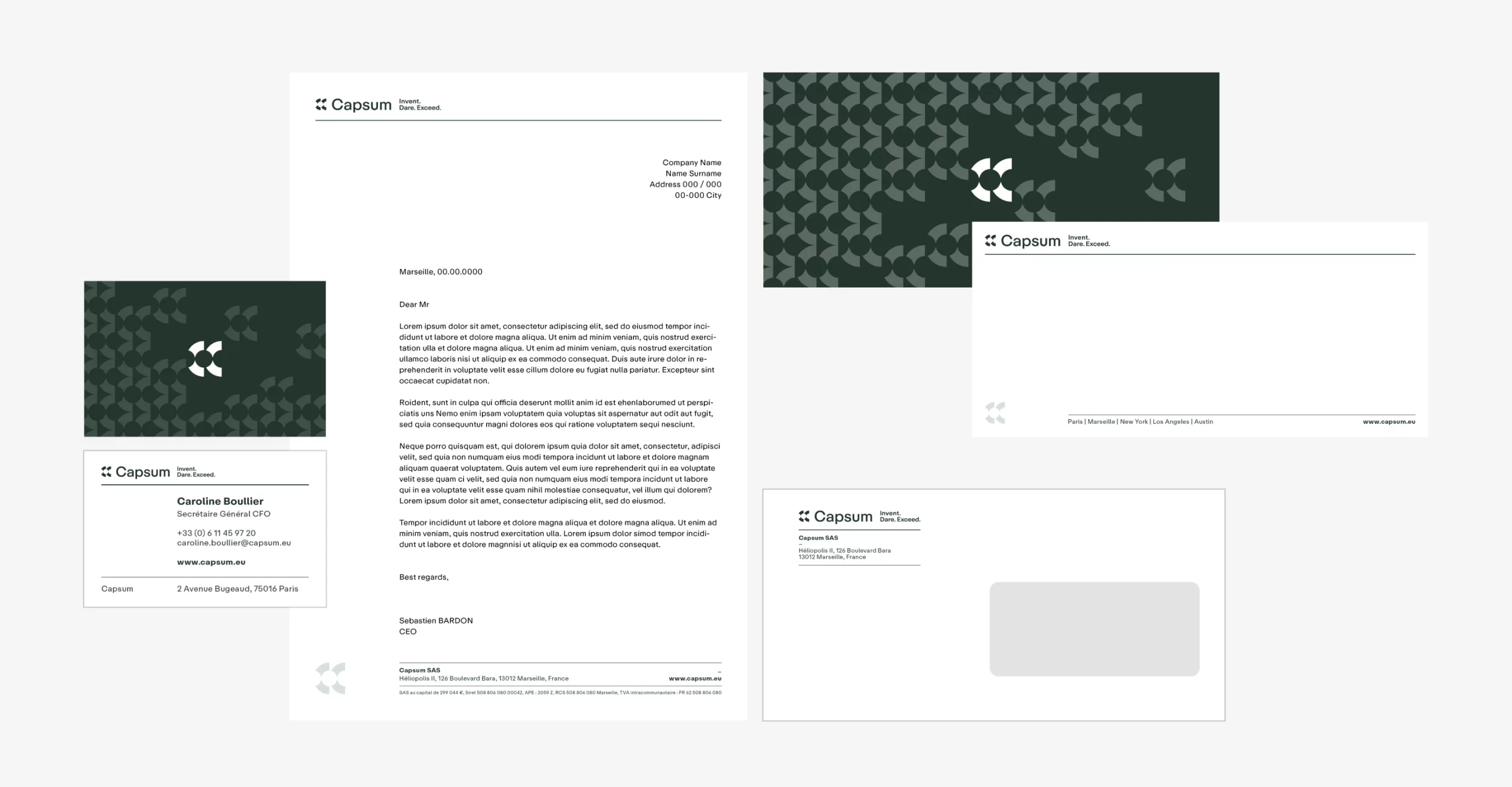
The color palette is a vital component of Capsum’s visual identity system. It helps the brand express its unique identity, maintain consistency across all platforms, and establisha clear visual hierarchy.
This ensures that Capsum’s branding is versatile enough to adapt to different contexts while still standing out and differentiating itself in the market.


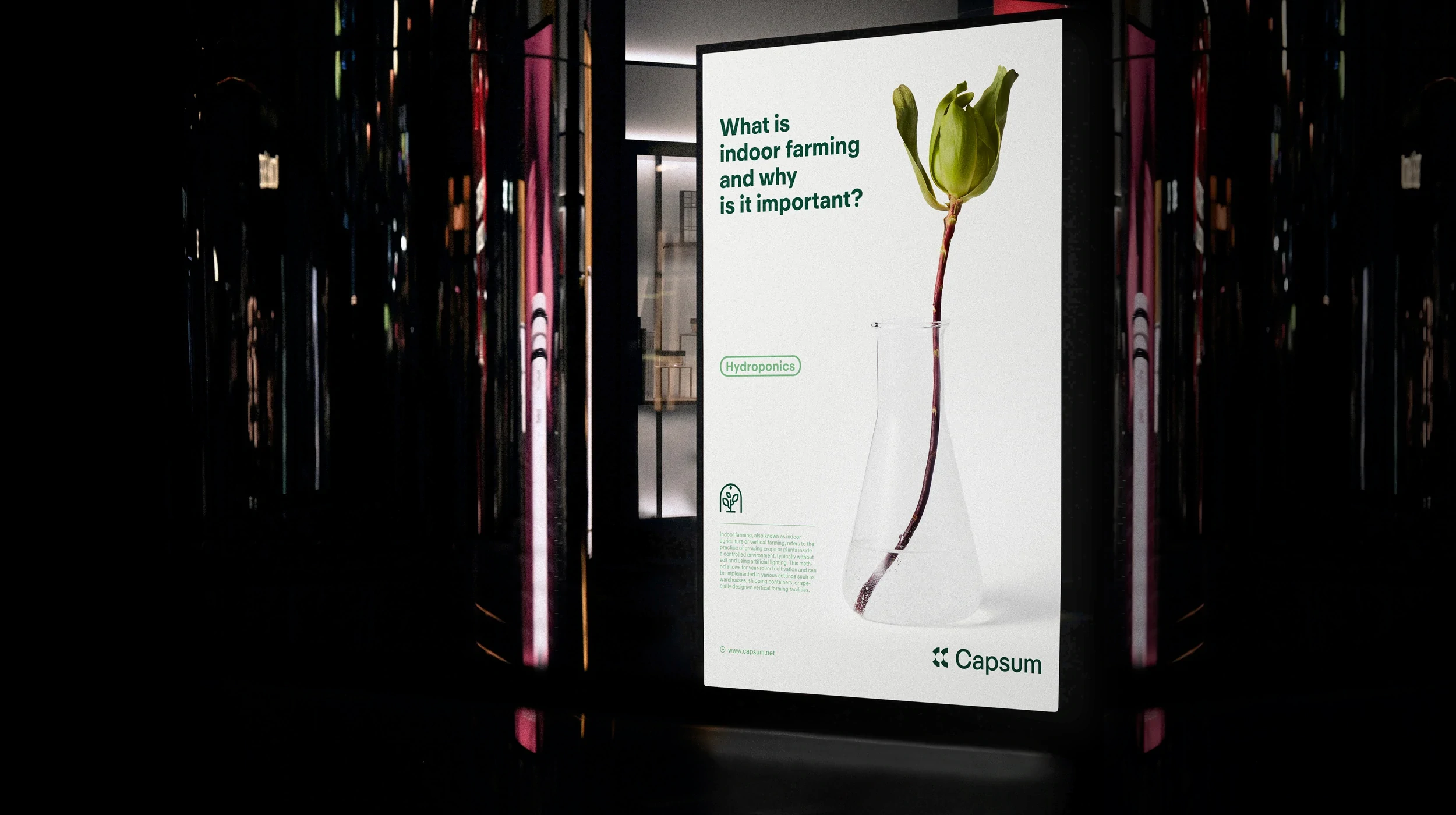
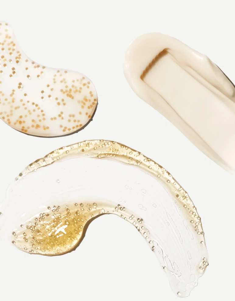
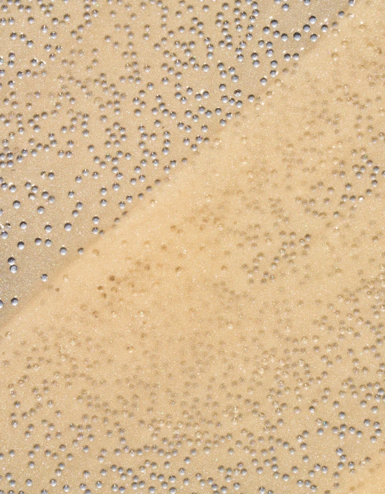
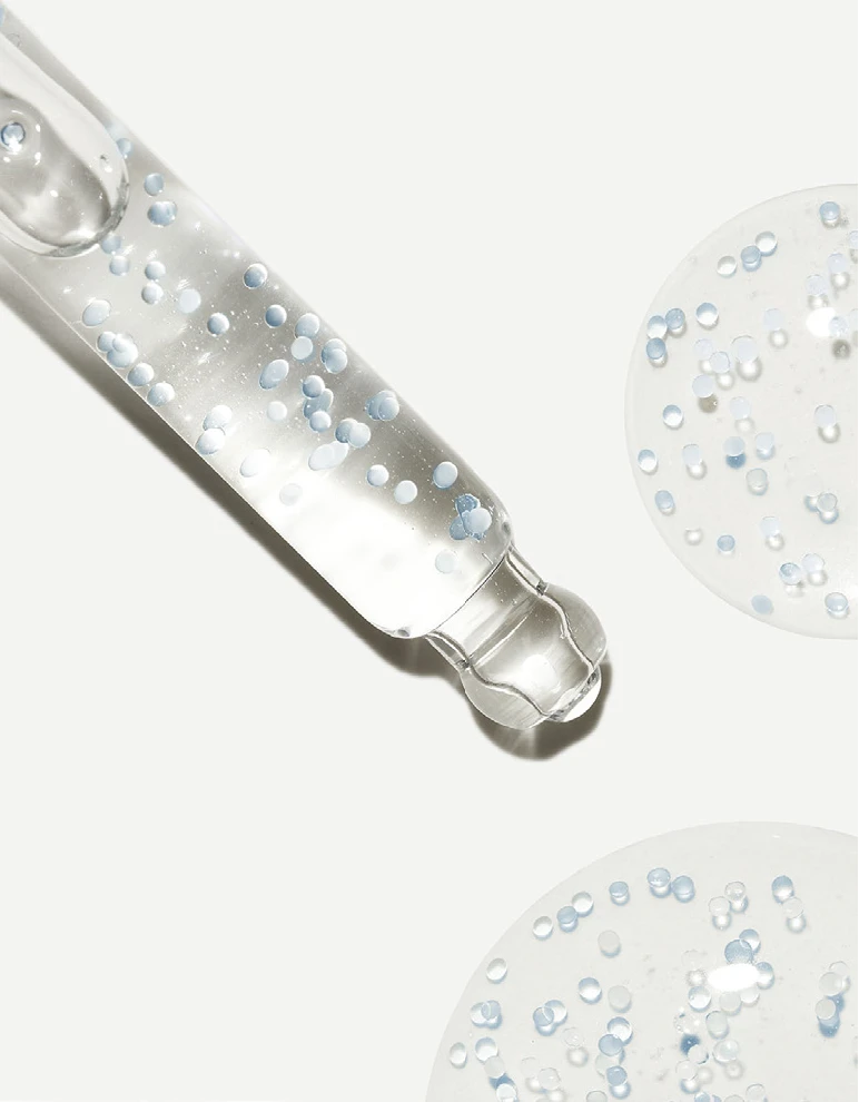
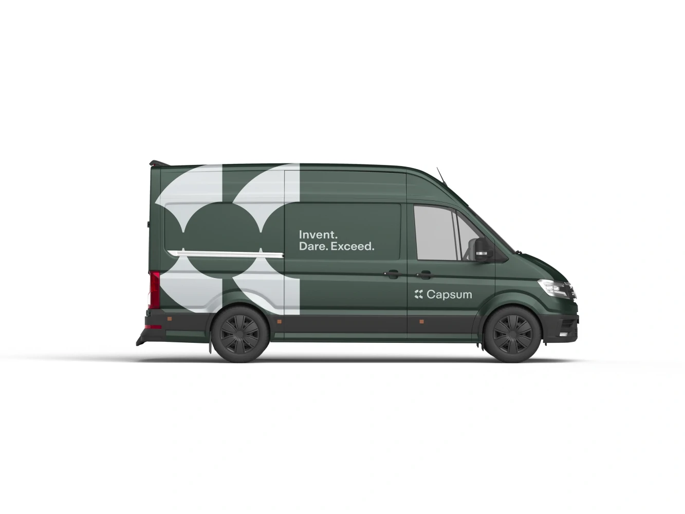
Patterns have become a versatile and powerful element in Capsum’s visual identity system, offering a dynamic way to reinforce brand recognition, evoke emotions, and create memorable experiences.
By integrating these patterns consistently across various touchpoints, we have enhanced the visual appeal of our branding, making it more engaging and distinctive. These patterns not only add depth and texture to our designs but also help in conveying the brand’s personality and values, leaving a lasting impression on our audience.
We created a grid system based on a 2:3 ratio. Utilizing this 2:3 ratio across all our layouts ensures harmonious and balanced communication materials. The format “A” is the closest match to this ratio, organizing the graphic area into a grid that effectively suits various communication requirements.
Summary of Capsum’s new Visual Identity
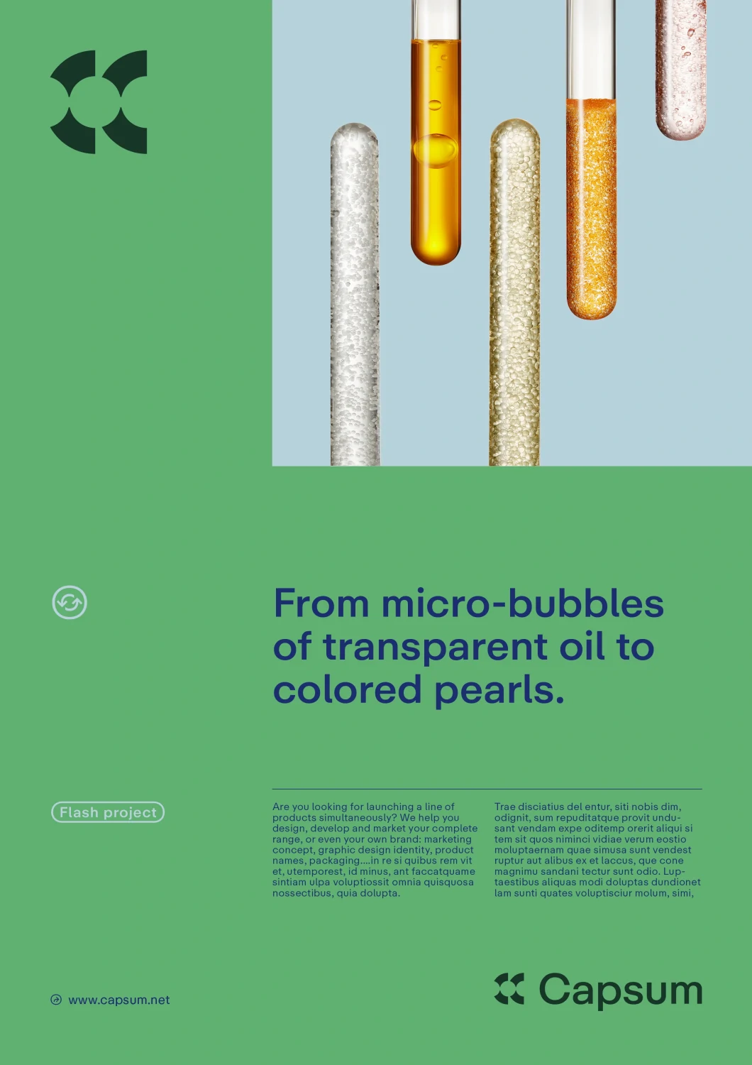
Capsum is a leading scientific company specializing in the development of innovative cosmetic products. Their formulas stand out due to a groundbreaking production process known as Microfluids.
In recent months, we have worked on a new visual identity for the brand. Our concept reflects the image of a modern and innovative company. Our goal was to create an unlimited graphic ecosystem that can be flexibly adapted to various communication needs.
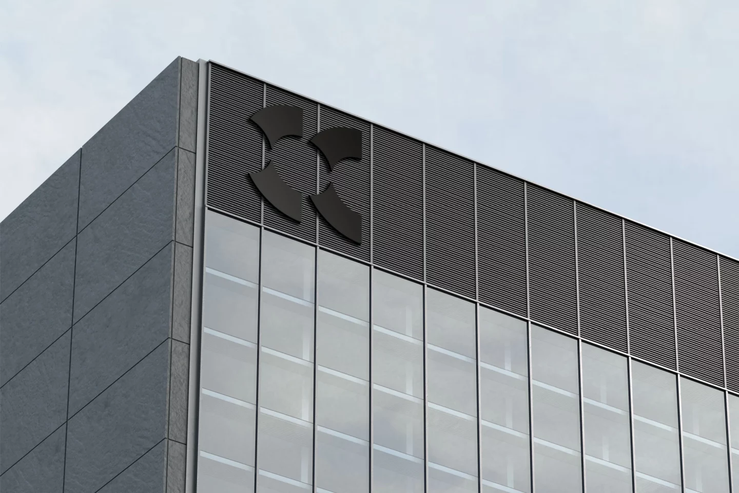
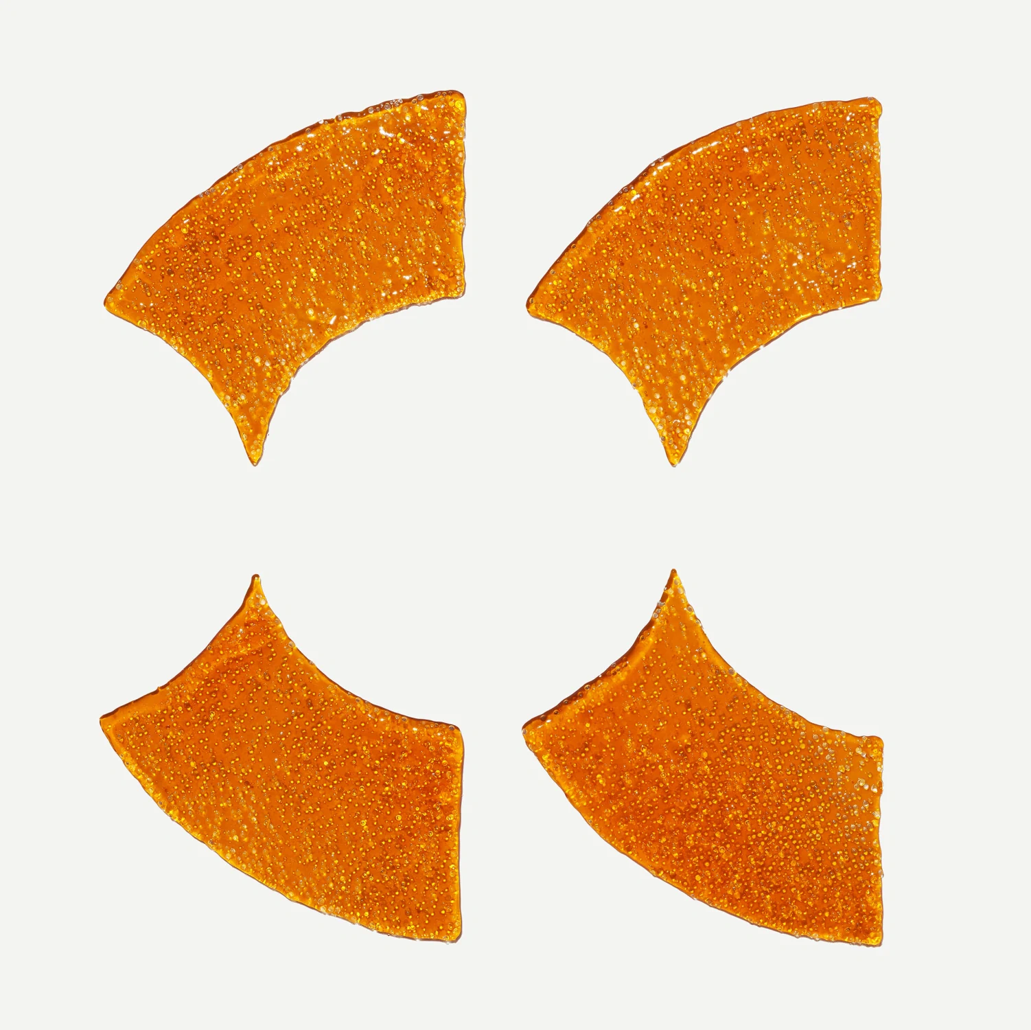
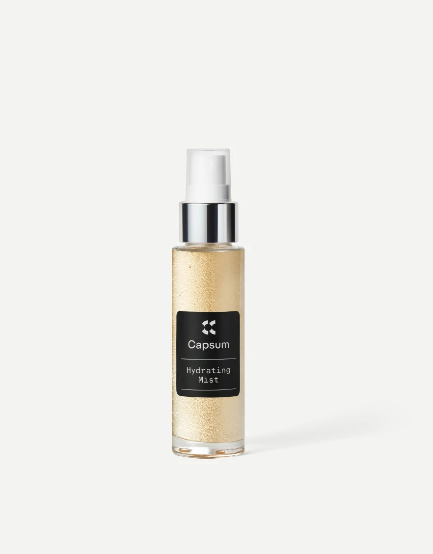
The logo we designed combines typography and a symbol. The emblem reflects the brand’s name and essence, using capsule-like shapes within the open space of the letter “C.”
We chose a geometric, sans-serif, modern typeface that perfectly complements the brand symbol. The typography incorporates distinctive elements that enhance functionality and improve readability.
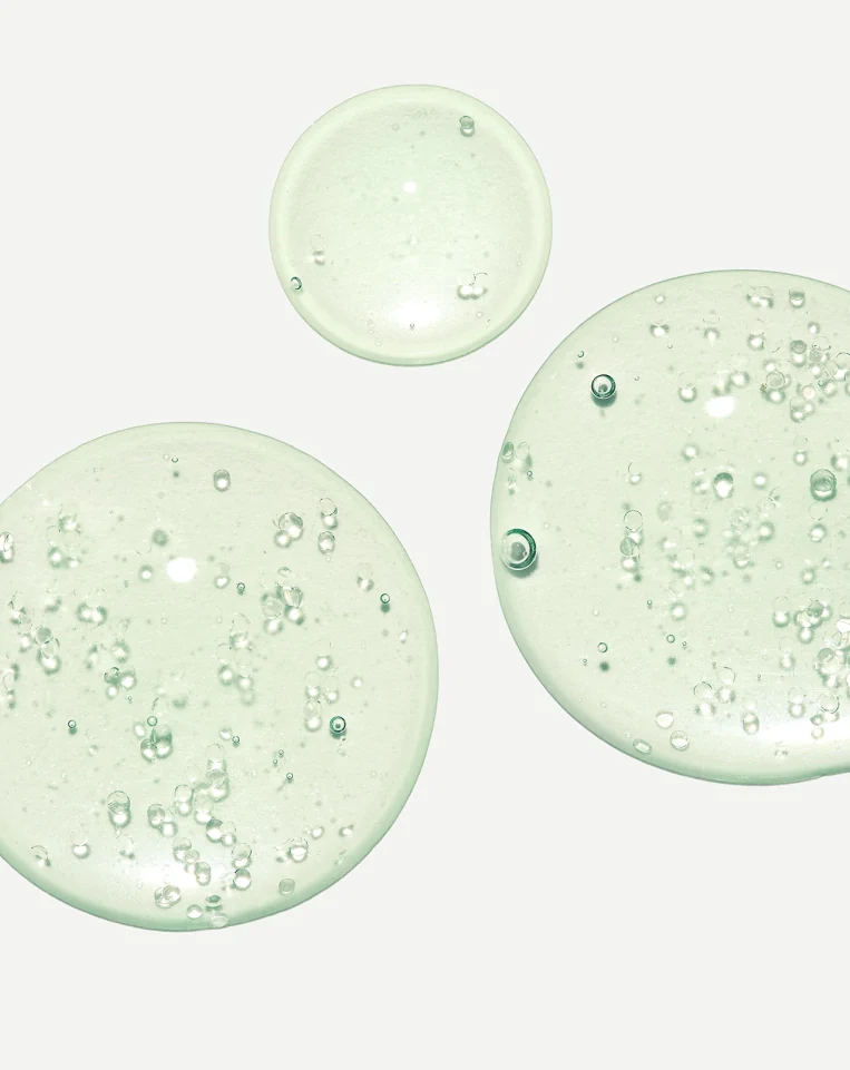
The colour palette is natural and fresh, covering a wide spectrum of shades that allow for diverse and creative applications.