Client
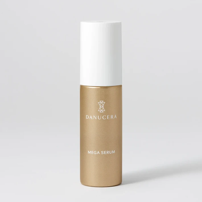
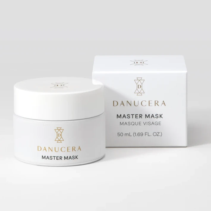
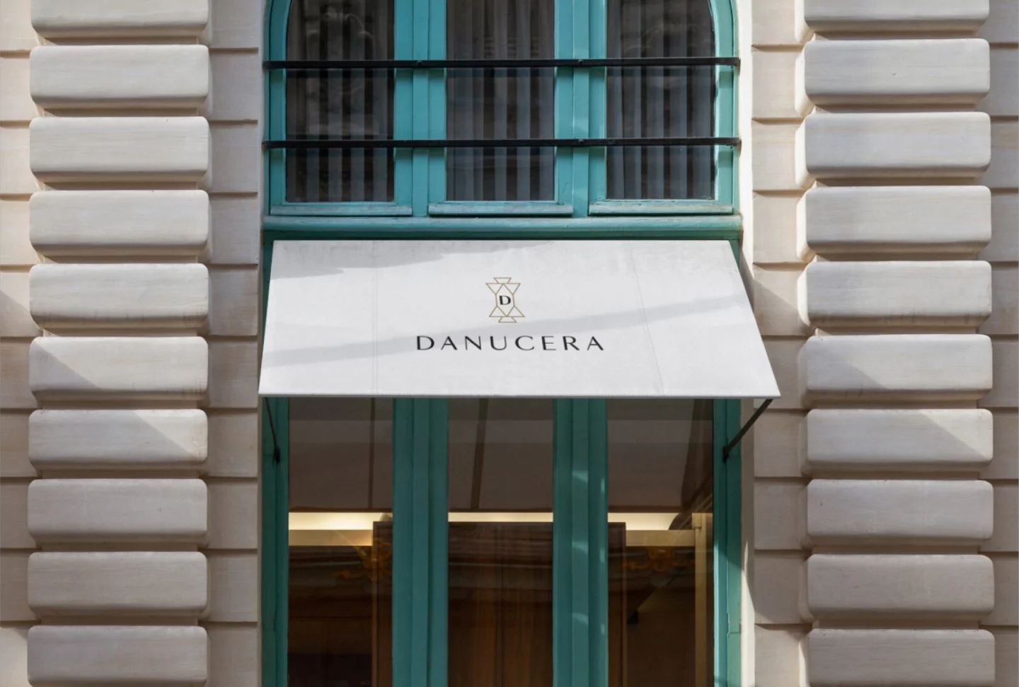
DANUCERA
DANUCERA – the story of a thousand faces – is a beauty brand created by celebrity facialist Danuta Mieloch.
Services
Logo Design Packaging Design Website Design Content Creation


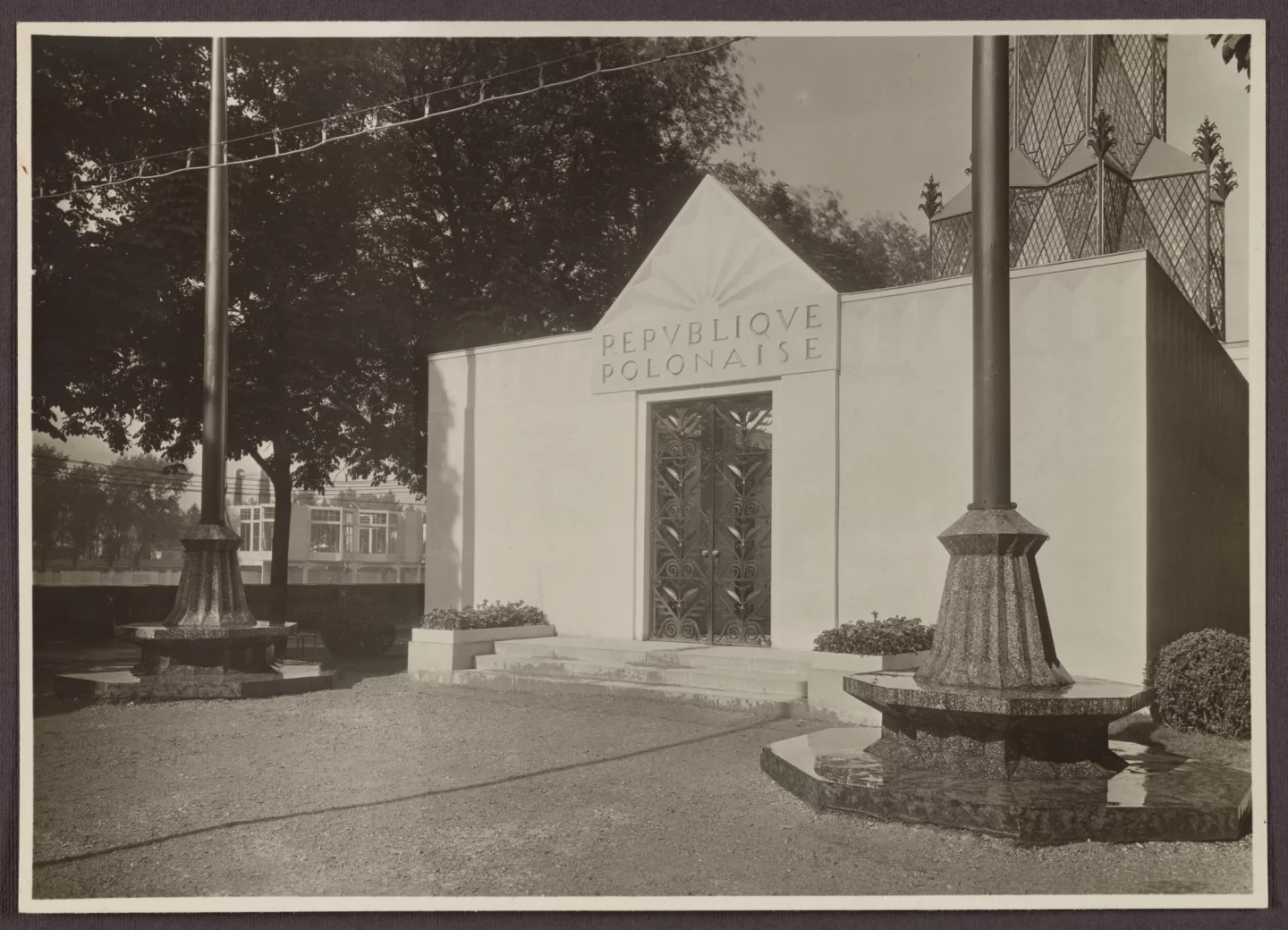
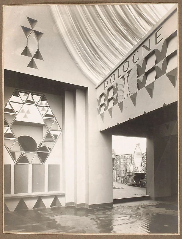
We drew an inspiration from the birth of Art Deco movement and the way it was interpreted by Polish artists in 1920s. Our key reference point was a Polish pavilion in Modern Decorative and Industrial Arts Exhibition in Paris in 1925 –
We loved how highly in tuned it was with the Zeitgeist, while remaining distinctively original, and thought in that it captured Danucera ethos of skincare philosophy perfectly – utterly modern, designed from the depth of the founder’s 30 year experience.


Summary
Our collaboration with Danuta Mieloch, the brand’s founder, began with projects for her renowned Rescue Spa locations in New York and Philadelphia. Our creative team captured the sophisticated interiors of these spaces and their popular spa treatments while unifying brand materials to establish a cohesive visual language.
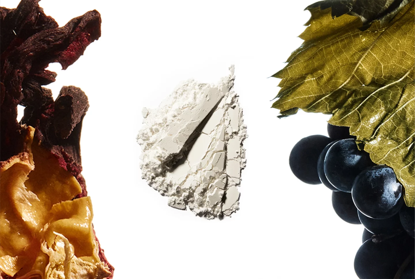
The inspiration stemmed from the early Art Deco movement and the works of Polish artists from the 1920s. A key reference was the Polish Pavilion at the 1925 Paris Exhibition, which blended the spirit of the era with the originality of Slavic soul—much like the Danucera brand, a synthesis of modernity and the founder’s 30 years of experience.
In the visual identity, we aimed to highlight Slavic roots, professionalism, and a “clean beauty” ethos.
We developed a comprehensive visual identity (logo, brand mark, colour palette, patterns, typography), designed product packaging, marketing materials, and the website. Additionally, we created social media content and designed retail displays.