Client
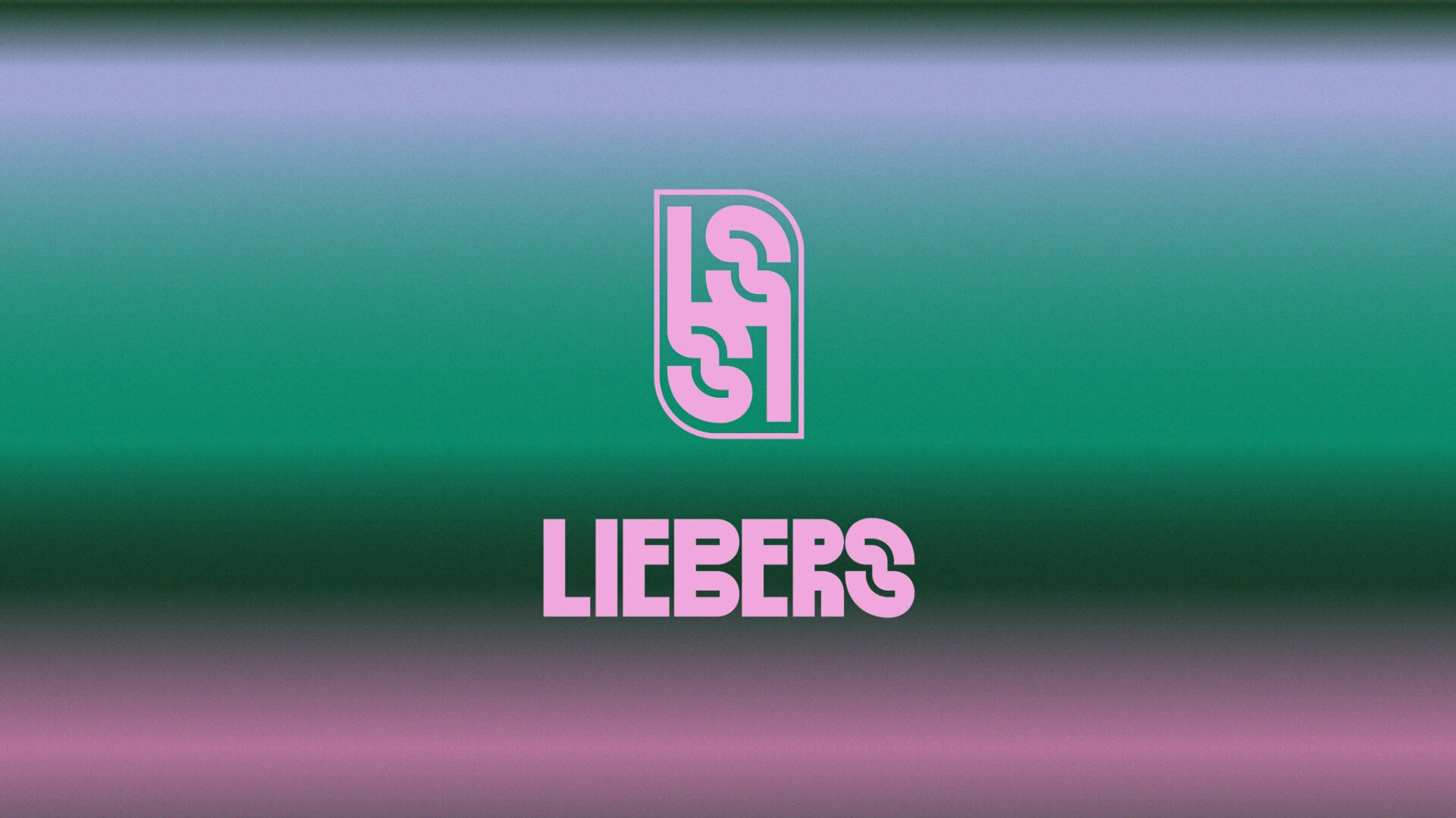
LIEBERS
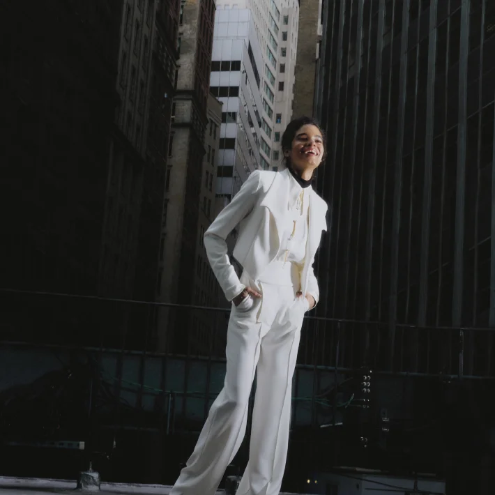
Bold style that blends elegance with brilliant chaos.
Services
Visual Identity Web Design Packaging Print Materials
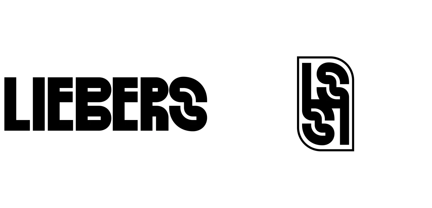
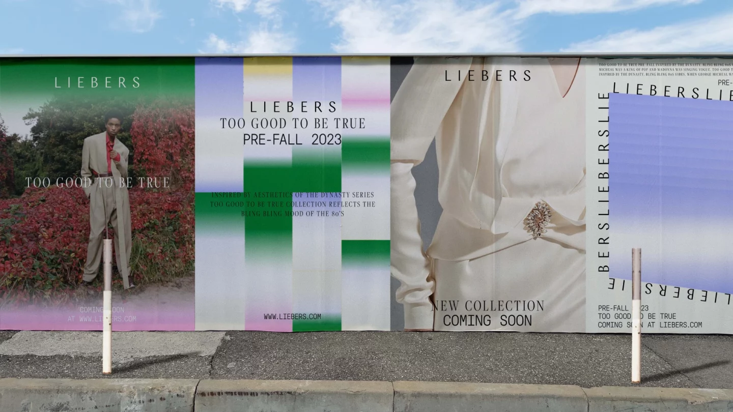
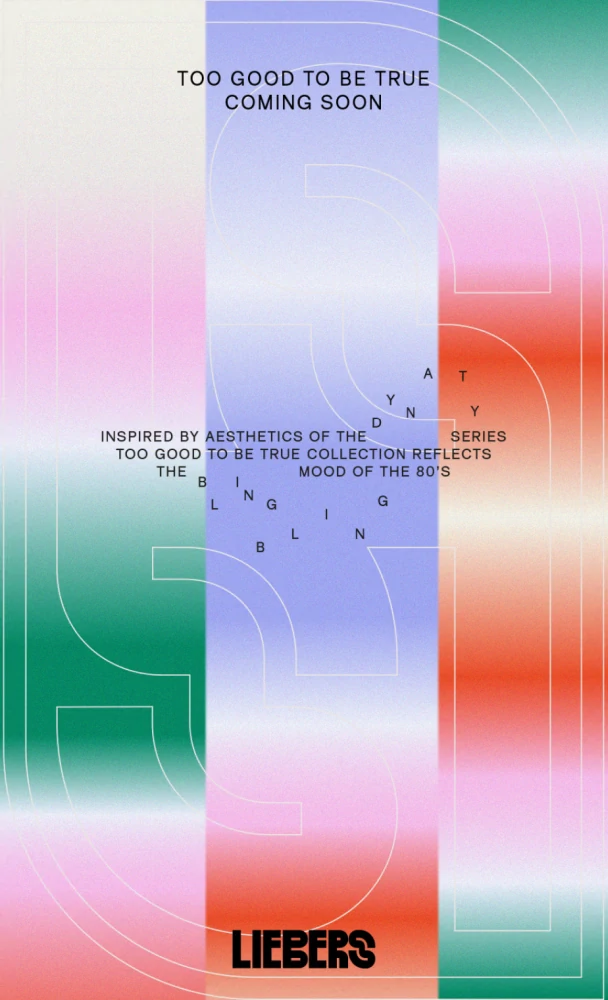
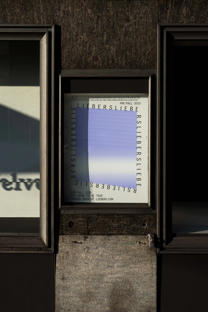
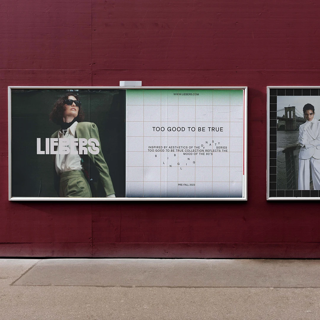
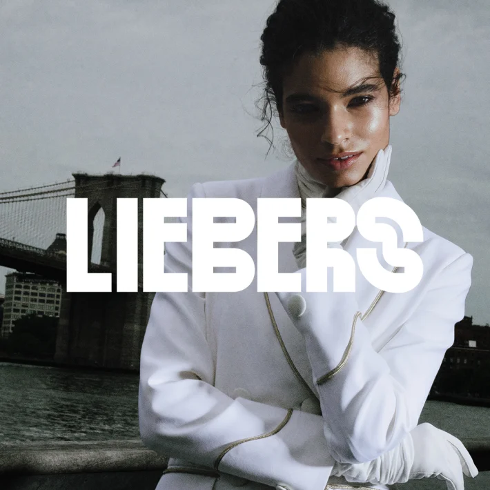
Our visual identity for the New York-based brand Liebers is a bold fusion of a striking logotype and custom typography, seamlessly paired with a more emblematic brand mark. Inspired by the charm of typewriter errors, the design embraces a playful yet distinctive character, ensuring the brand stands out in the fast-paced fashion industry.
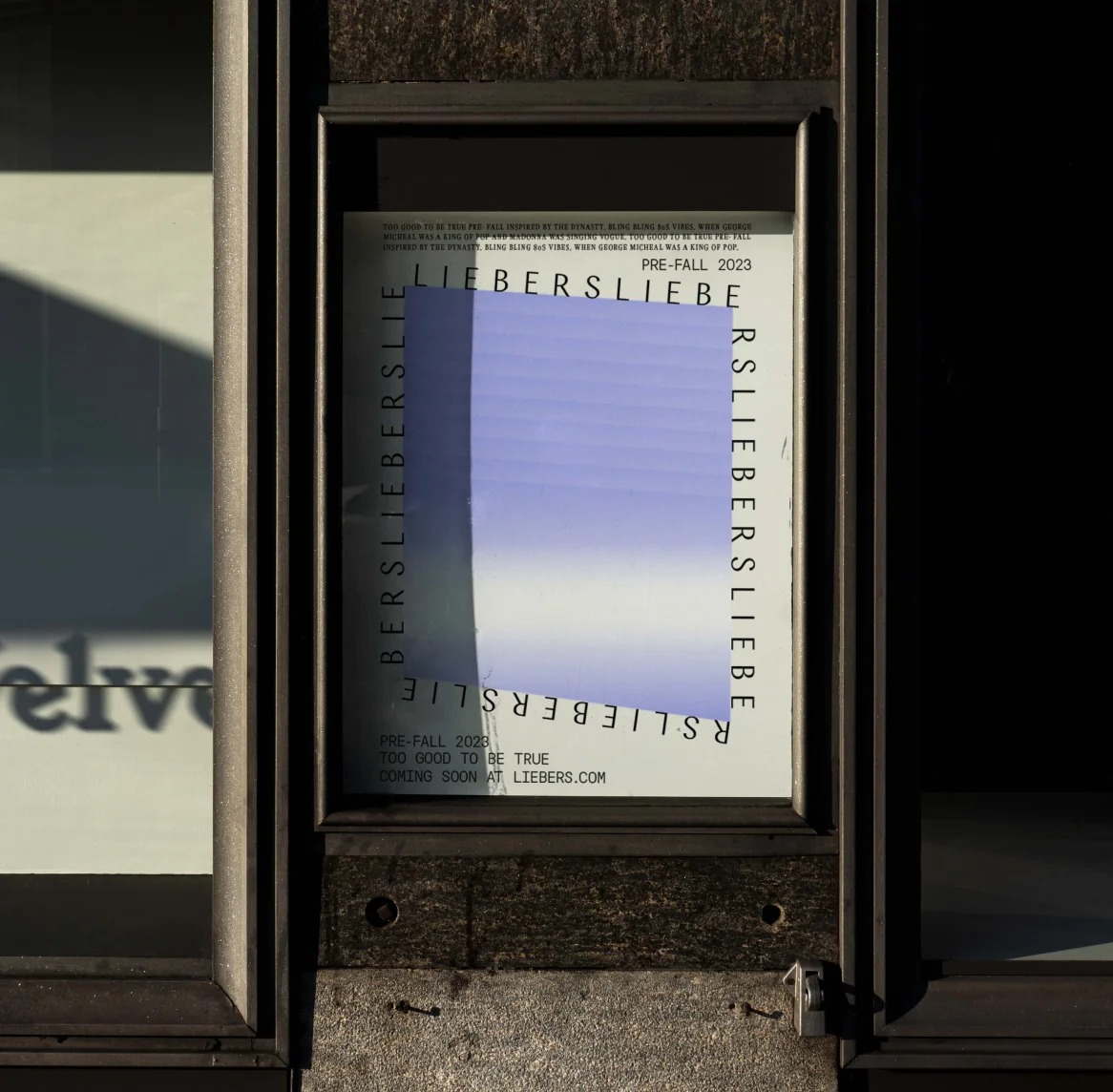
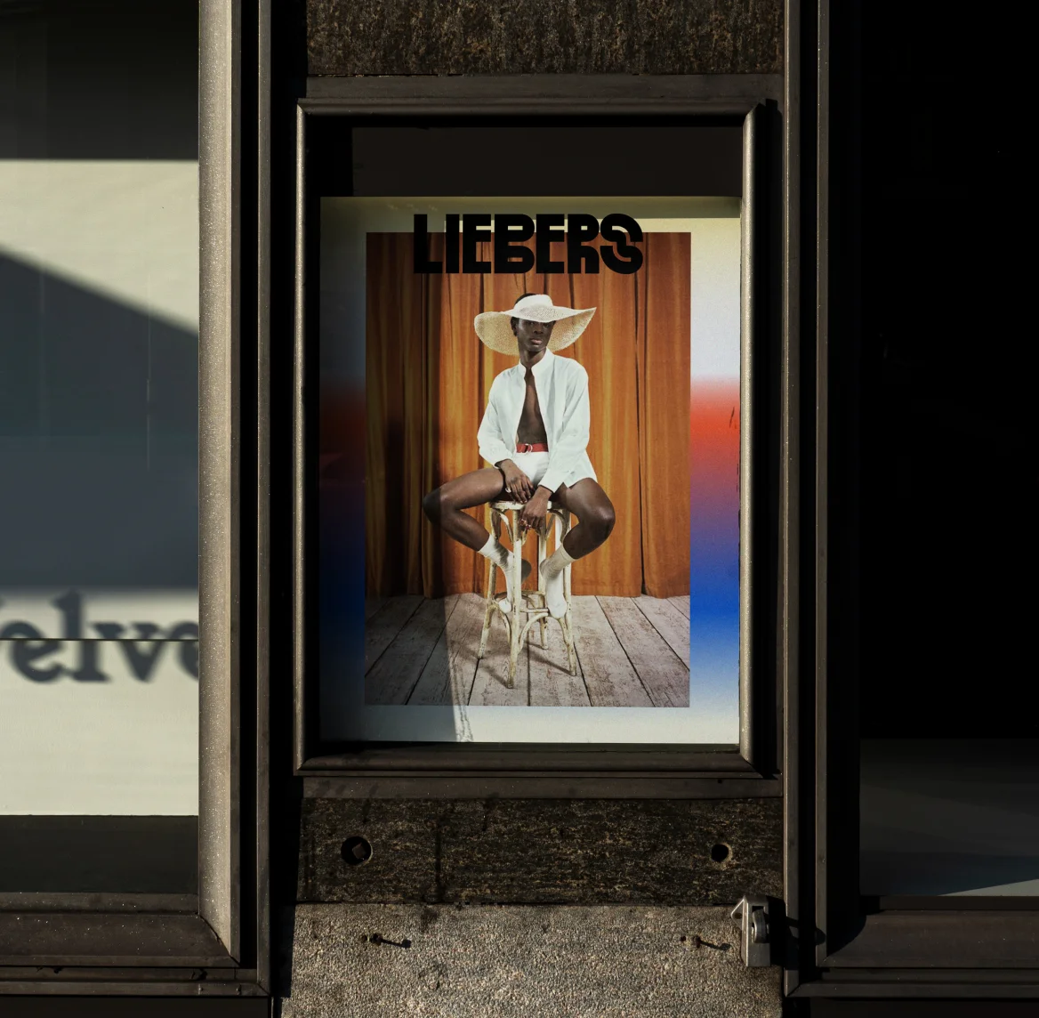
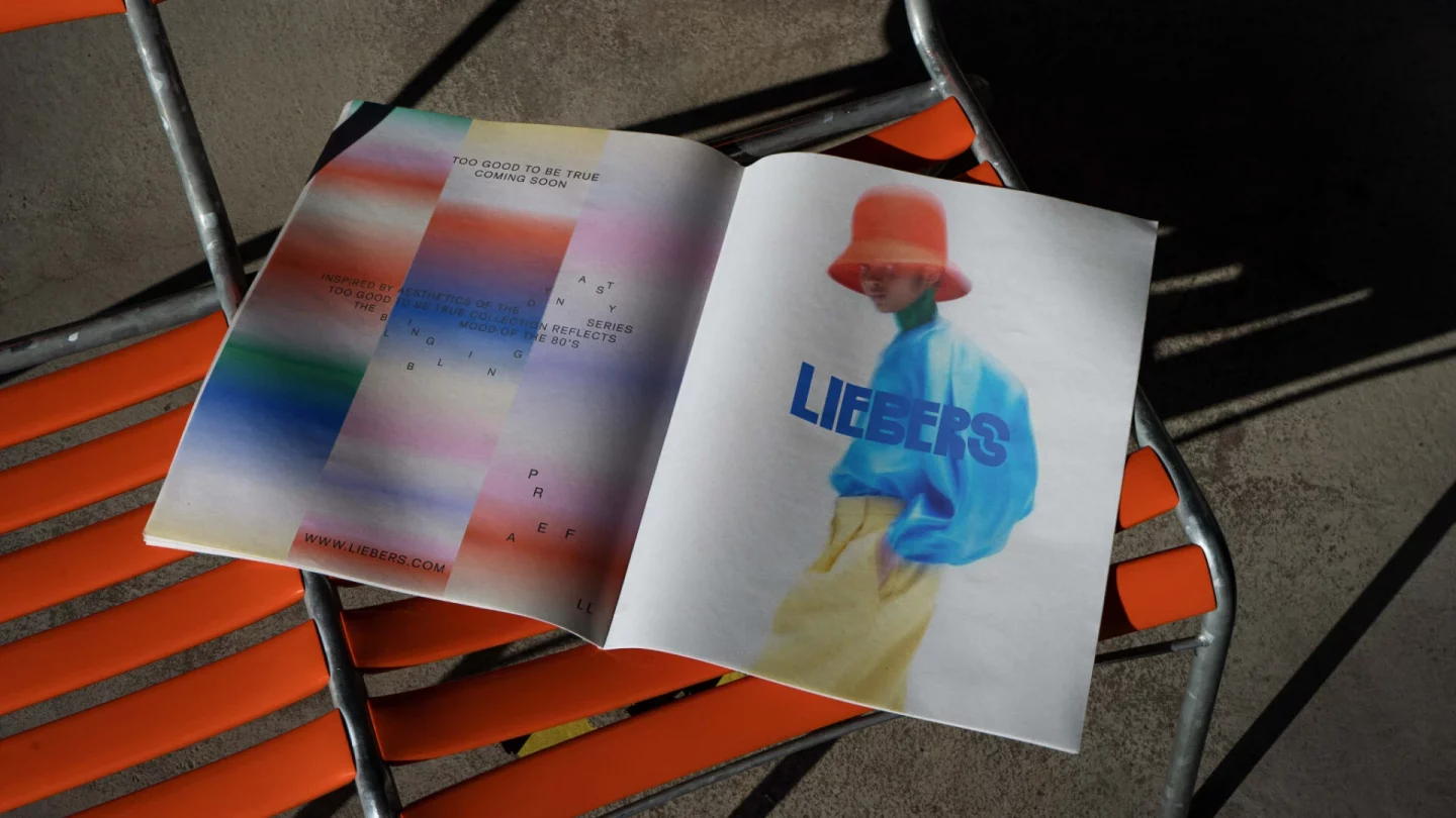
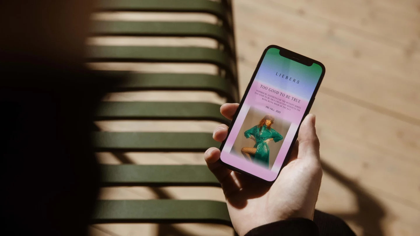
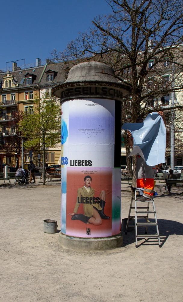
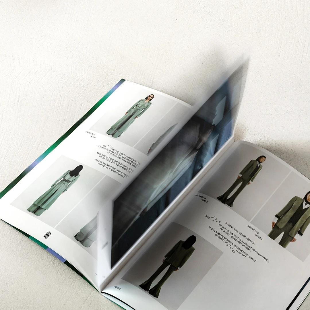
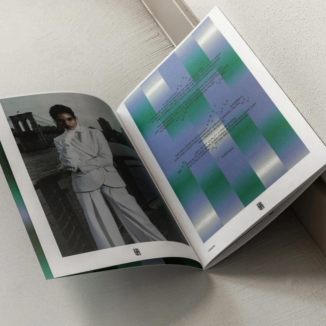
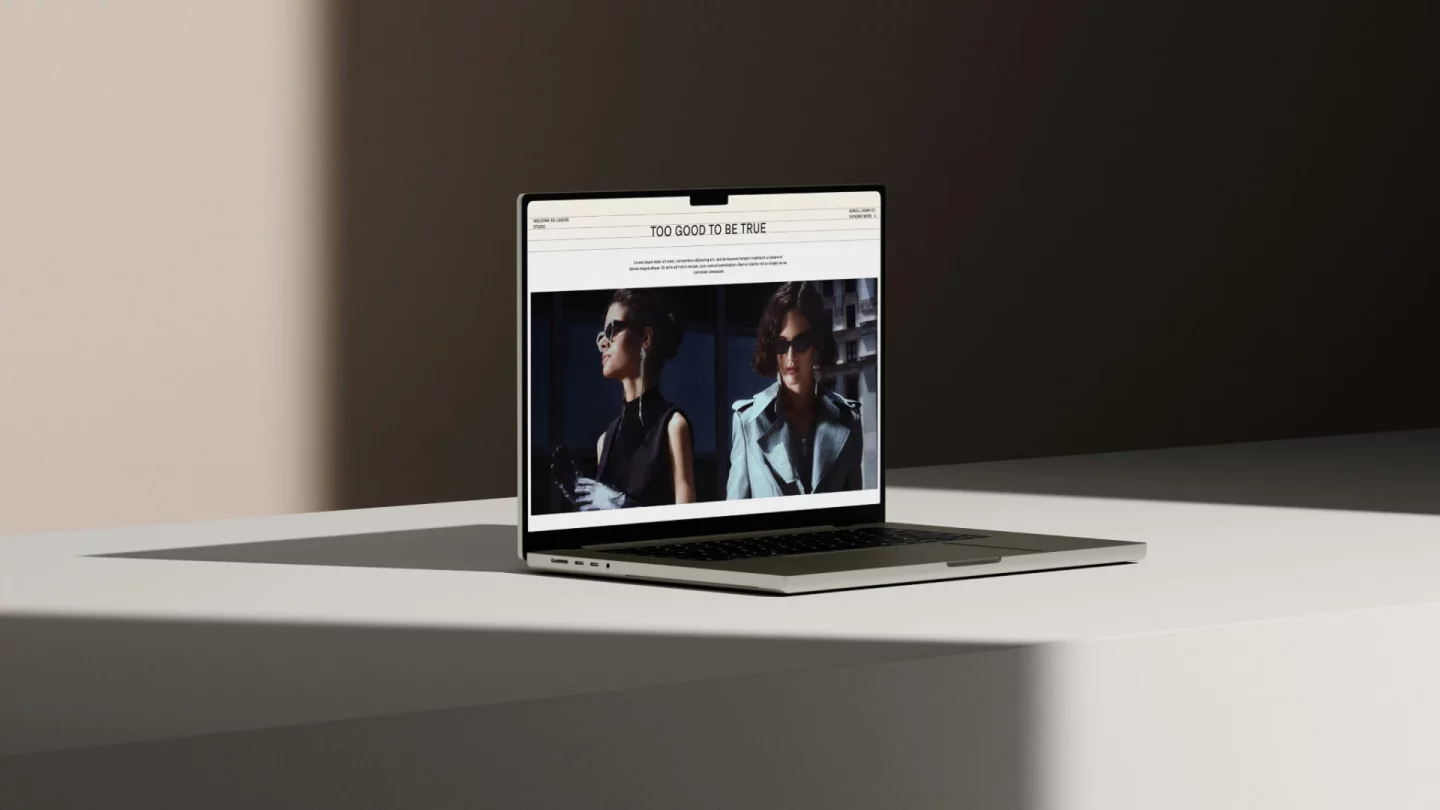
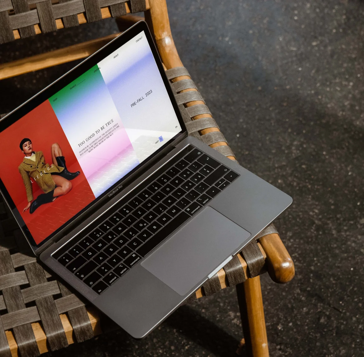
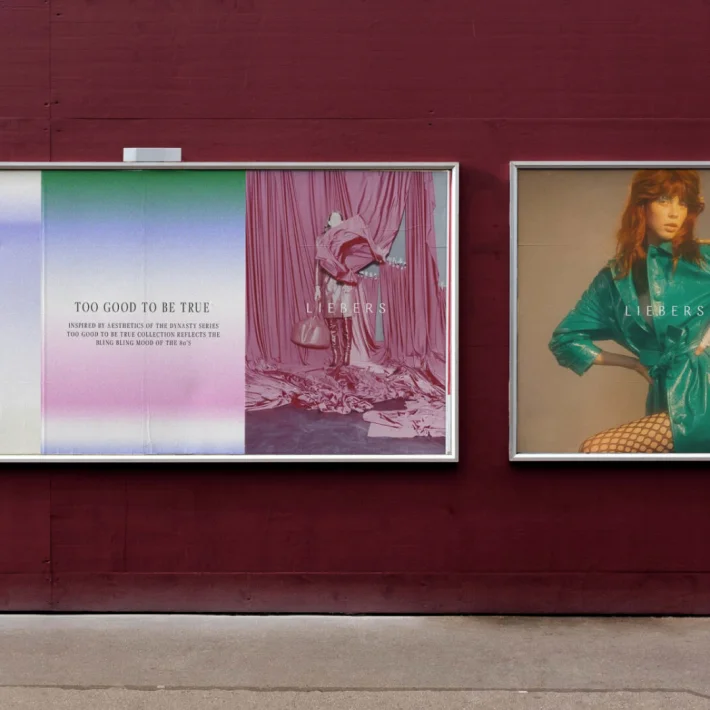
We created a cohesive and memorable identity, including a logotype, monogram, color palette, bespoke typography, editorial design, and printed materials. Every element was thoughtfully packaged in custom-designed materials. Additionally, we were responsible for the web design, crafting both the main website and the e-commerce store to provide a seamless and engaging digital presence.


Summary
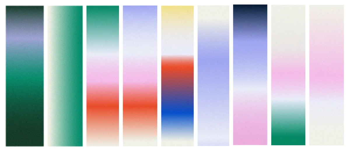
A bold logotype paired with typography mimicking typewriter errors emphasizes the daring character of the brand, inspired by soap operas and typography from faded faxes. A decorative and elegant monogram contrasts with the strong, assertive letterforms of the logotype. An additional element of the identity is a grid system and a collection of patterns built on gradient-based compositions.
The entire color palette of the brand identity is reflected in the selection of eco-friendly papers used for printing product catalogs, tags, envelopes, and tissue paper.
The goal of creating such a distinctive identity was to make it stand out in the highly competitive fashion market.