Client
PAPIEROWY DIZAJN
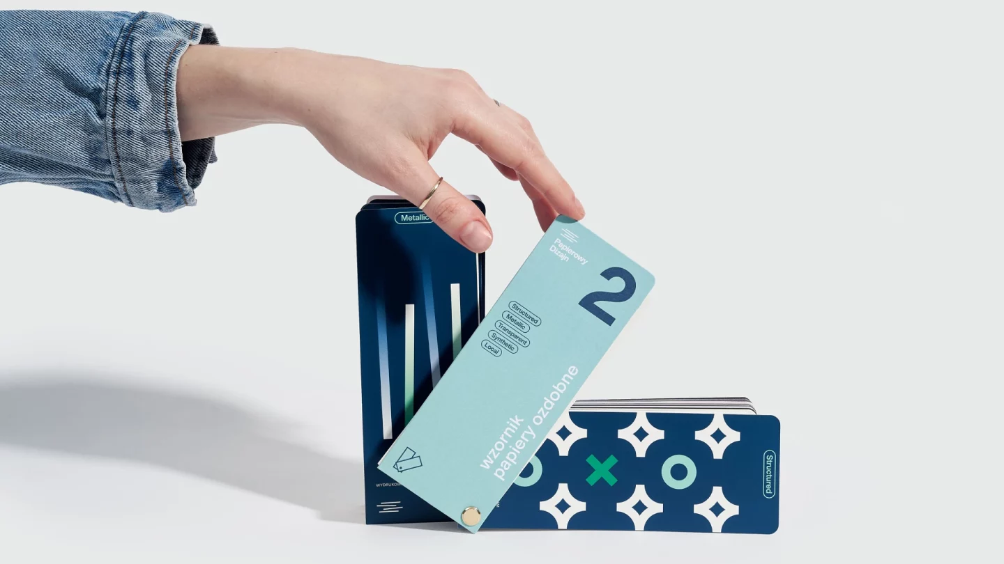
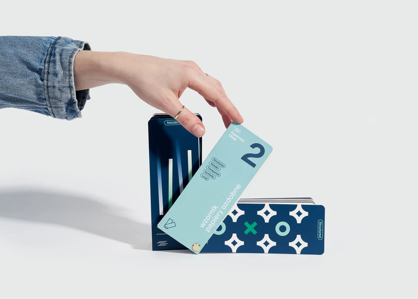
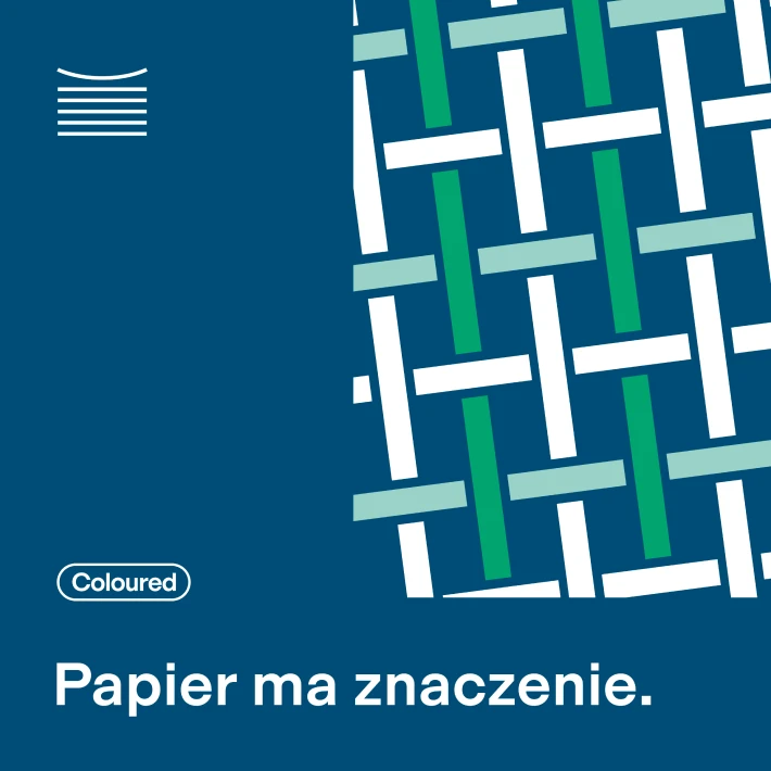
Paper in the spotlight.
Services
Strategy Creative Direction Rebranding Photo Shoot

Summary
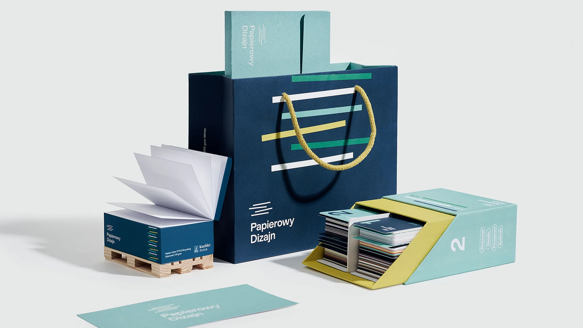
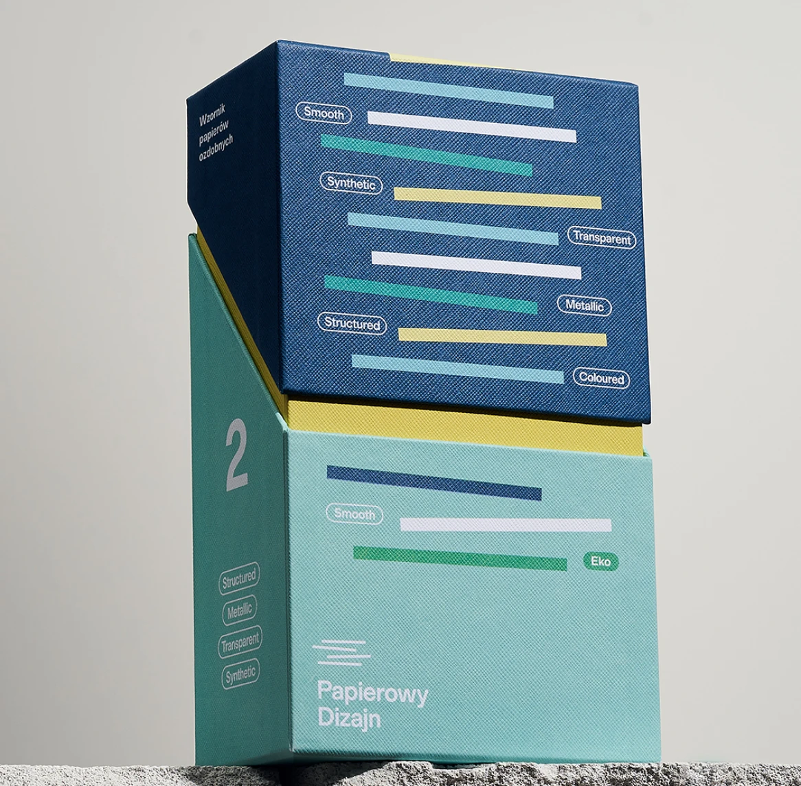
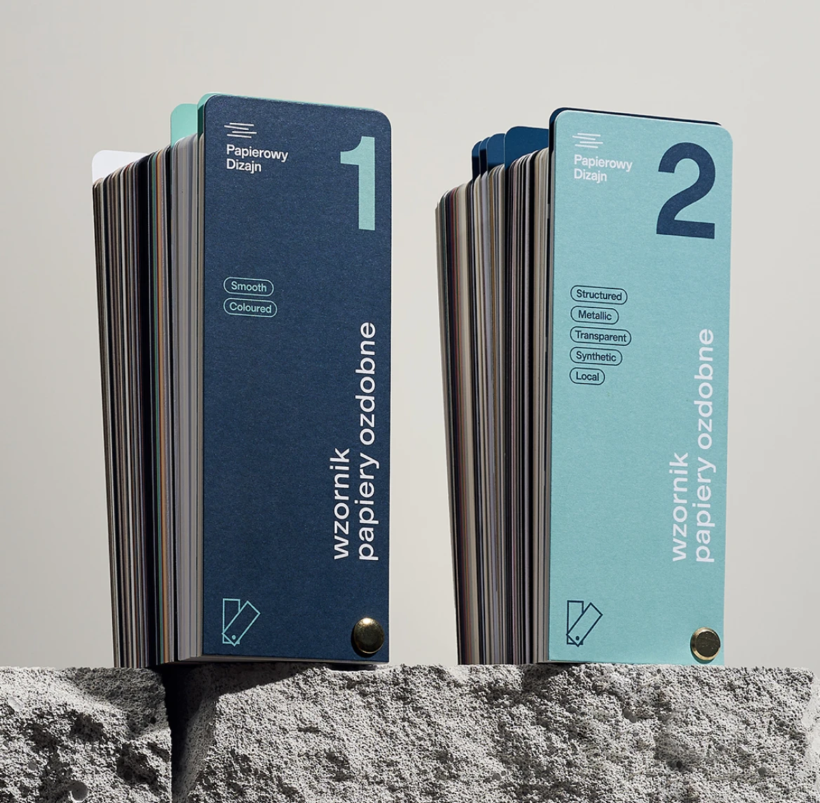
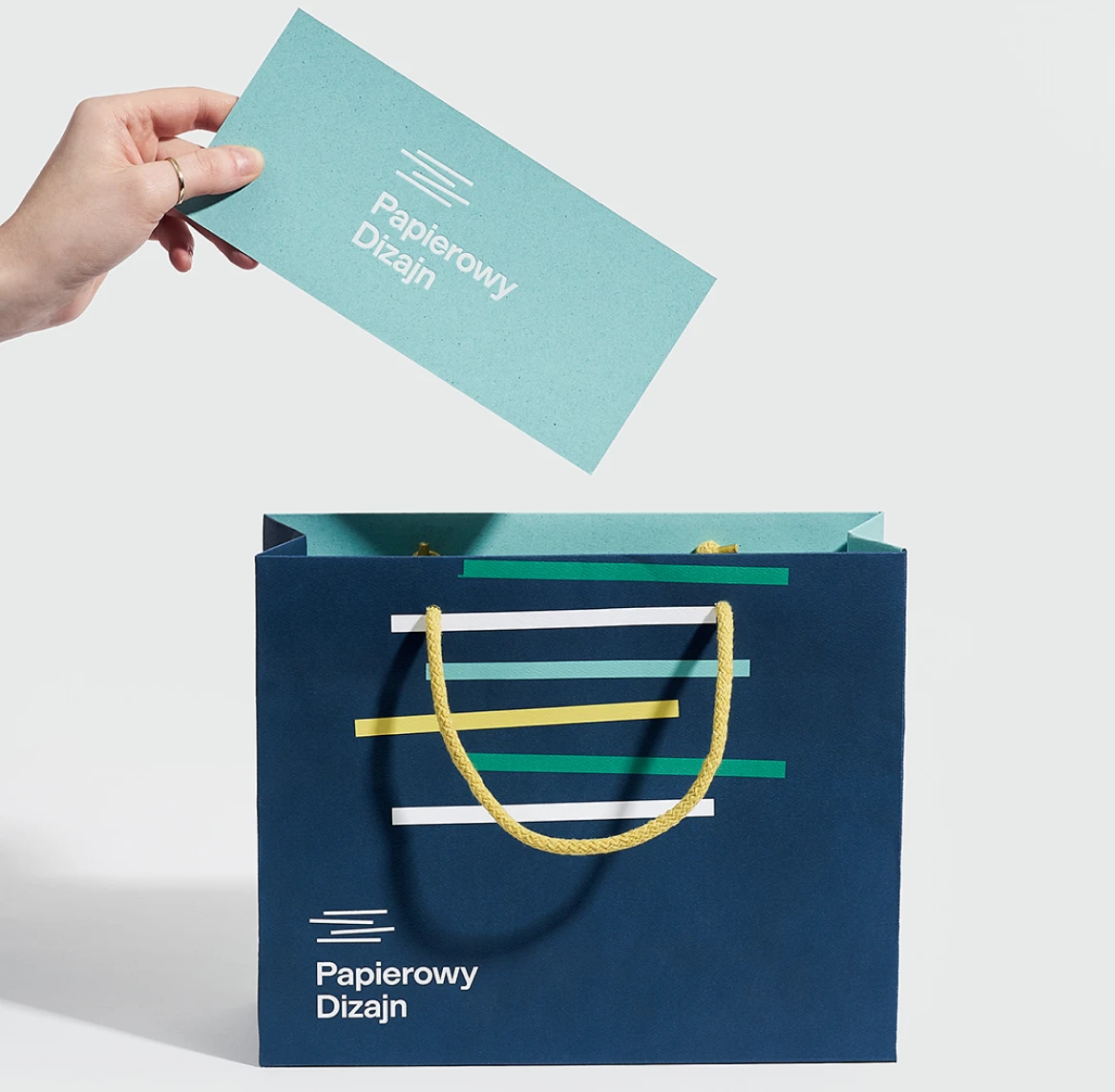
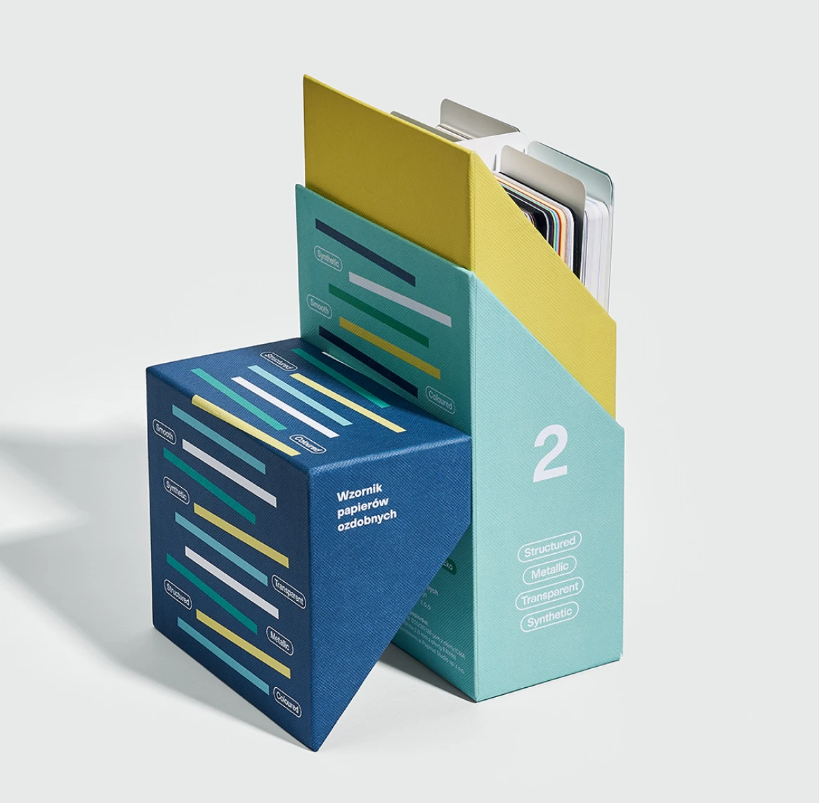
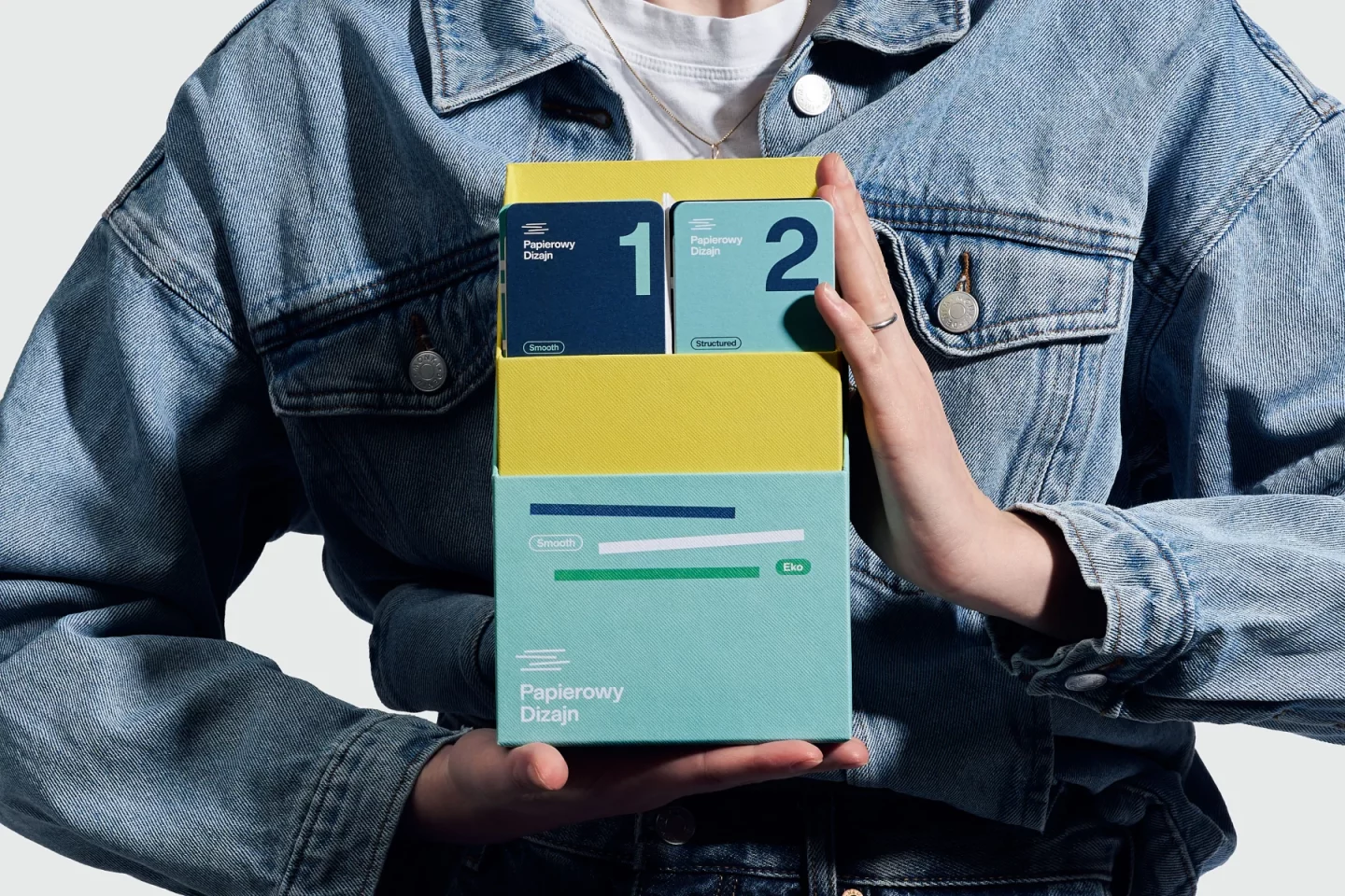
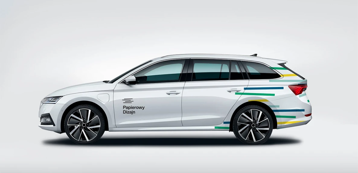
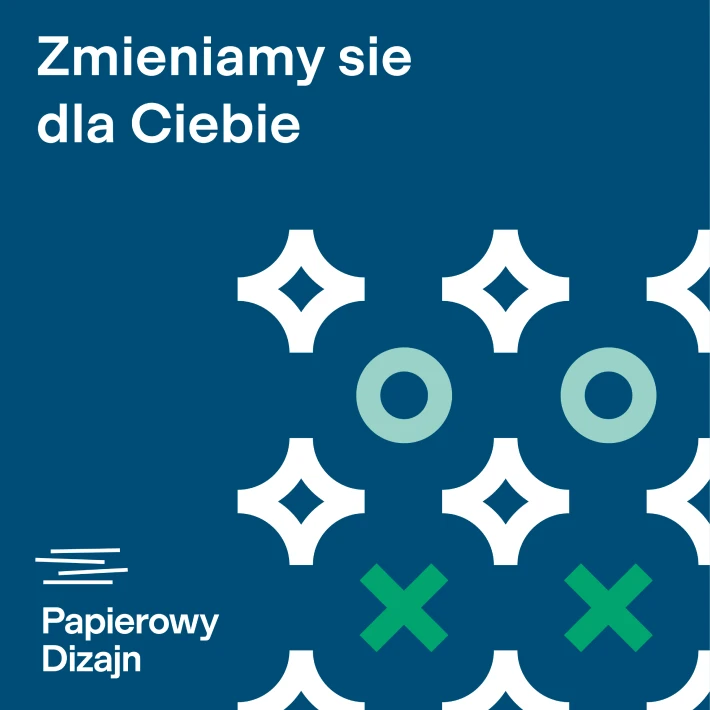
The result of the collaboration with Papierowy Dizajn is a refreshed visual identity that brings paper and its character to the forefront. The symbol is a dynamic, simple form that evokes the image of falling colorful sheets of paper. The combination of a geometric shape with a modern, timeless typeface emphasizes the modernity of the identity.
From communication strategy, through the new image and promotional materials, to the artistic direction of the photoshoot – the result is a modern, refreshed visual identity that highlights the brand’s character and its paper-based DNA.