A Brand Is No Longer (Just) a Logo
Why Contemporary Branding Must Be a Living System
For decades, the branding landscape was governed by a modernist paradigm: the conviction that an organization’s identity rests upon a single, inviolable mark codified within a restrictive brand manual. In an analog era, this model worked with remarkable precision. In today’s reality of distributed media, dynamic interfaces, and relentless sensory noise, however, a static mark has ceased to be a self-sustaining center of gravity.
Moving beyond this logocentric era does not mean discarding tradition. On the contrary: contemporary, adaptive branding draws its deepest strength from classical modernism, from formal discipline, ruthless reduction, and an uncompromising drive toward functional clarity. In our studio practice, we explore how to unite that rigorous synthesis with the demands of multifaceted modern formats across both print and digital environments.
From Static to Dynamic: The Rebirth of Modernist Synthesis
To understand how a single mark became the supreme nucleus of identity, one must look back to postwar modernism between the 1950s and 1980s, particularly the rise of Corporate Modernism. Rooted in absolute reduction and an unyielding faith in functionalism, this movement distilled corporate identity into a geometric, monolithic anchor: a singular mark serving as the ultimate guarantor of order and the focal point of the visual hierarchy.
This ethos is unmistakable across the canonical work of the era’s masters:
- Paul Rand, creator of timeless marks for IBM, UPS, and ABC.
- Otl Aicher, architect of Lufthansa’s identity and the visual language and pictograms of the Munich 1972 Olympic Games.
- Studio Chermayeff & Geismar (now Chermayeff & Geismar & Haviv), authors of defining identities for Chase Manhattan Bank, Mobil, NBC, and Xerox.
Modernism by definition championed “less is more” and the absolute primacy of function. Its practitioners sought an objective, universal form stripped of subjective indulgence and arbitrary ornament. It was in this spirit that the Swiss School (International Typographic Style) emerged. Shaped by luminaries from the Zurich circle, such as Josef Müller-Brockmann, Max Bill, and Adrian Frutiger, alongside Basel figures including Emil Ruder, Armin Hofmann, and Karl Gerstner, their disciplined mastery of modular grid systems and modern sans-serif typography laid the bedrock for corporate graphic design. The defining watershed arrived in 1957 with the near-simultaneous debuts of Adrian Frutiger’s Univers and Max Miedinger’s Helvetica, both expanding on the legacy of the earlier Akzidenz-Grotesk.
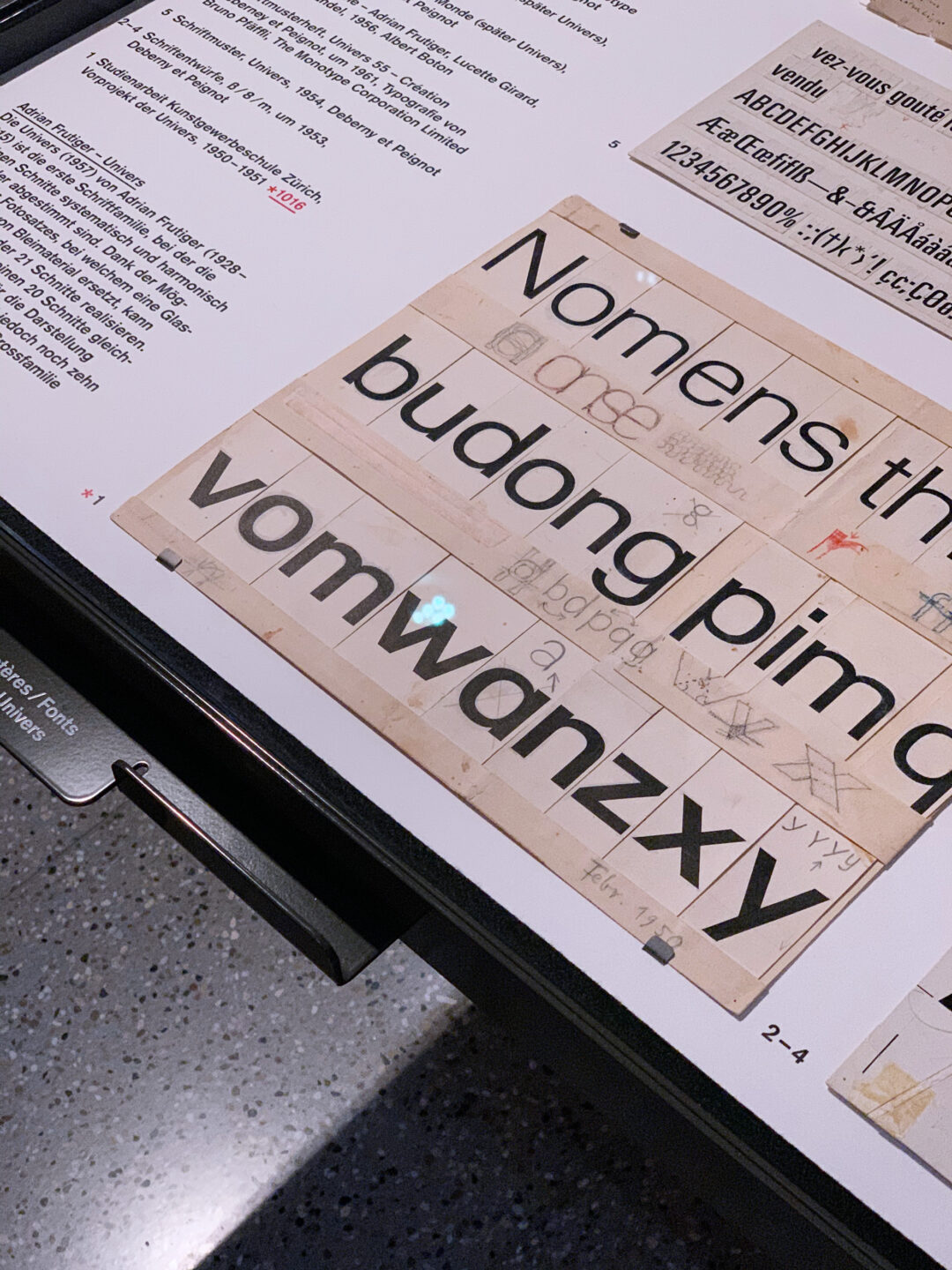
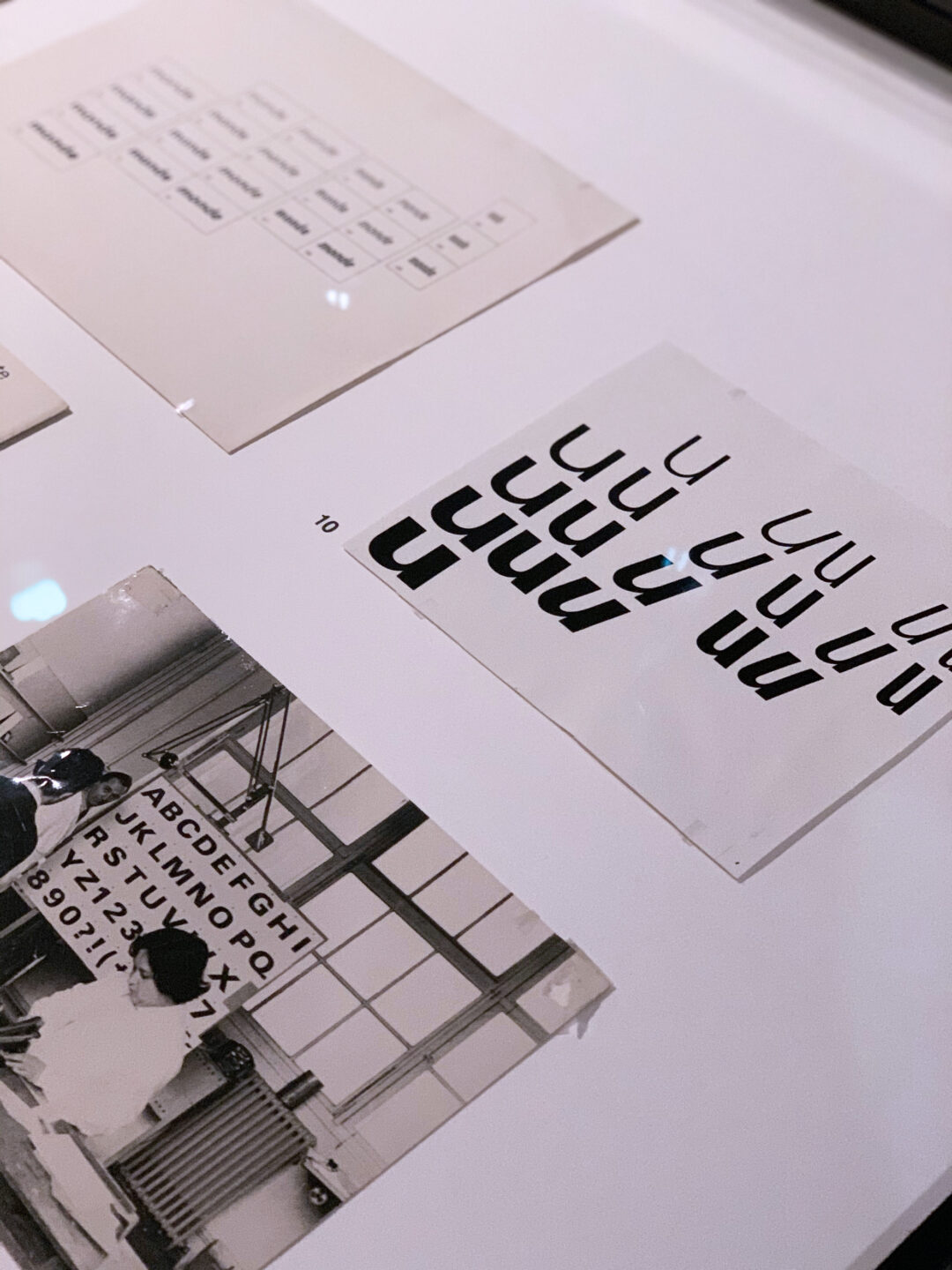
Original sketches for Adrian Frutiger’s Univers typeface (1957). Photography: author’s own archive.
A crucial milestone in integrated corporate communication was the Swiss pharmaceutical company J.R. Geigy AG. Throughout the 1950s and 1960s, Geigy deployed a holistic design system (shaped by Karl Gerstner, Max Schmid, and their peers) across packaging, scientific publications, and advertising, forging an unprecedented visual coherence. Yet while Swiss modernists catalyzed the impulse to lock identity into an unyielding mark, it was also within their circle that the first ideas of systematic variability were born. In his seminal 1964 treatise Designing Programmes, Karl Gerstner proposed replacing static forms with flexible, rule-based procedures. Two decades later, this concept erupted into mass culture: in 1981, Manhattan Design introduced the identity for MTV. The logo was no longer a sacrosanct seal; it became an open container for ever-shifting animations, palettes, and textures. It was the first mainstream demonstration that identity could thrive on kinetic transformation.
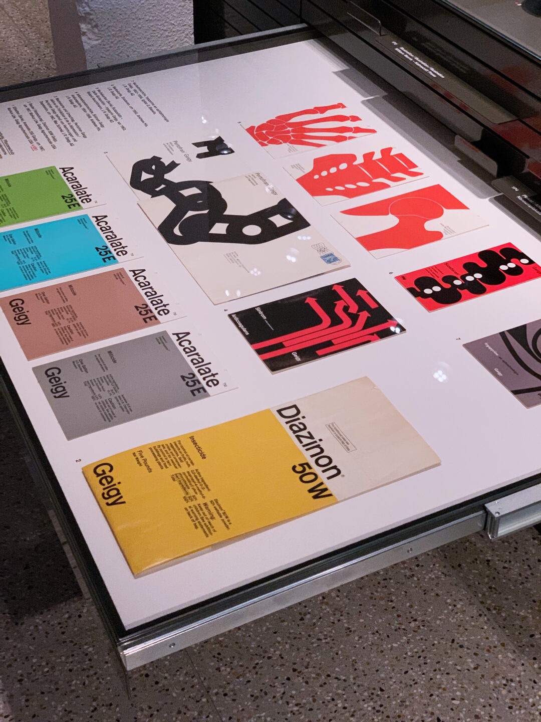
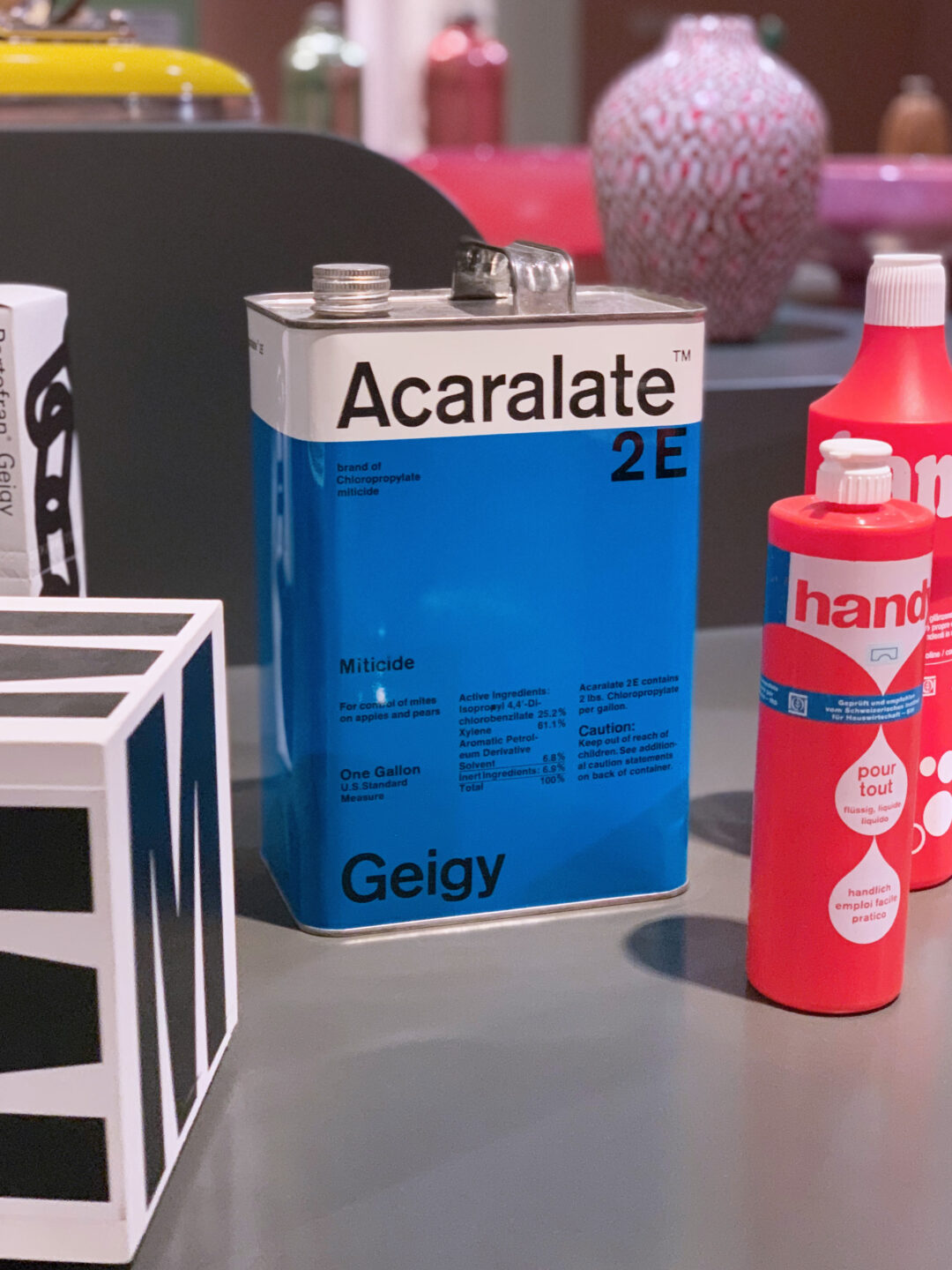
Original packaging and product labels for J.R. Geigy AG. Photography: author’s own archive.
Traditional brand manuals were conceived for a predictable, ruler-measured world. They codified clear spaces, distortion prohibitions, and rigid rules for a closed catalog of collateral: letterheads, business cards, vehicle livery, and architectural signage. In an analog era, this level of control functioned seamlessly. Establishing a brand’s presence across a city was simply a matter of disciplined repetition, like painting a monumental logo across the masonry of an urban facade.
The model fractured when formats multiplied and brand touchpoints exploded. Today, an inventory of prohibitions and a monolithic mark are no longer enough. When an identity must live simultaneously as a 15×15 pixel browser favicon (what Bill Gardner in his LogoLounge reports aptly termed the ultimate stress test of form), within animated UI micro-interactions, across tactile premium print, and throughout physical spatial design, a static mark subjected to extreme scaling loses fidelity. As Per Mollerup highlighted in his analysis of communication noise, an inability to adapt to the medium introduces both technical and semantic distortion. Or as Dr. Martin Lorenz observed: in a complex media environment, the traditional logo becomes “too monosyllabic, while the situation requires eloquence”.
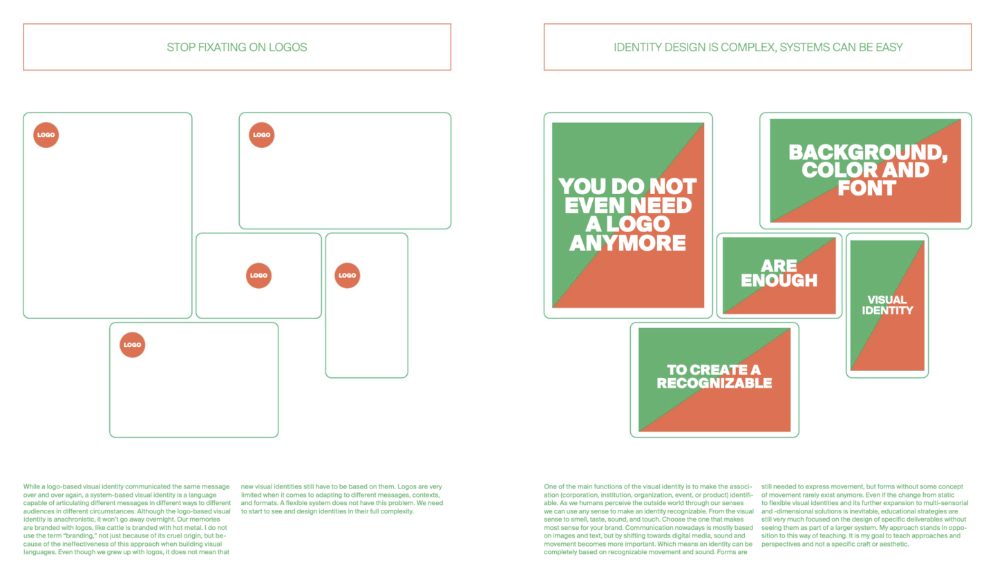
Martin Lorenz, Flexible Visual Systems, Slanted Publishers (courtesy of the publisher via Issuu).
The Modernist Lesson: Synthetic Form Within a Living System
Transitioning to a Living System is not an invitation to visual noise or arbitrary chaos. The strongest contemporary identity systems do not abandon synthesis; they translate modernist discipline from the isolated mark to the broader ecosystem.
Designing contemporary identities through the lens of Irene van Nes’s definition of a brand as a “living organism,” we maintain that a mark can, and should, remain synthetic, memorable, and ruthlessly reduced. The distinction is that it no longer operates as a standalone stamp, but as an anchor for an elastic visual language:
- Modular Architecture (Grid Systems): Channeling Josef Müller-Brockmann’s grid methodologies, we treat visual identity as a structural dialogue between elements rather than a symbol floating in a vacuum. The grid orchestrates spatial rhythm and proportion, ensuring the brand retains its structural integrity whether articulated on a physical poster or a mobile viewport.
- Autonomy of Primary Elements: In mature branding, color and bespoke typography can carry the full weight of recognition without the physical presence of the logo. A distinctive custom typeface, an intentional palette, and disciplined layout rhythms form an unmistakable voice. The mark becomes a finishing touch, a visual punctuation mark, rather than the sole carrier of meaning.
- Motion and Material as Discipline: UI animation and substrate selection are never decorative afterthoughts. The choreography of interface components, interaction pacing, and the tactile quality of a print finish are governed by the same principles as typography: their role is to guide the user and articulate character, not indulge in visual bravura.
When these components harmonize, the identity achieves true maturity: it can withdraw its logo entirely from a given touchpoint, yet remain unmistakably recognizable.
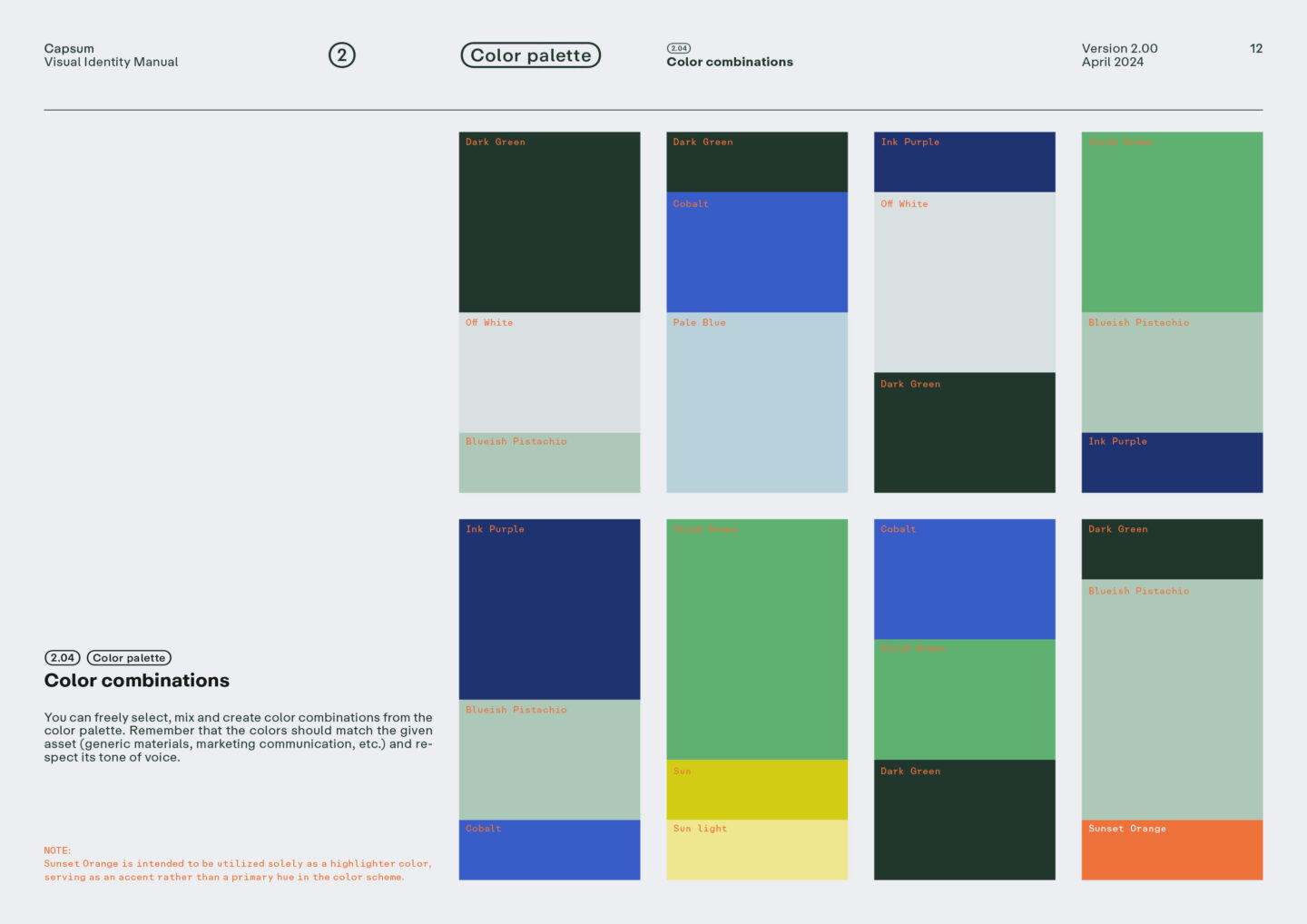
Capsum corporate identity as an adaptable system of rules. A dynamic color framework and modular icon construction grid illustrate how creative freedom within a defined structure ensures seamless omnichannel cohesion.
Scalability and Universal Logic: From Boutique Brands to Corporate Giants
The true power of system-driven design lies in its inherent scalability. Whether crafting an identity for an independent boutique concept or a global conglomerate, the underlying architecture remains identical.
A visual system operates like the syntax of a language. For an emerging, agile brand, we construct a lean, precise rulebook (a distinct typographic hierarchy, an edited palette, and a clear modular grid), enabling it to present an authoritative voice and stand out instantly. For enterprise-scale organizations, that same structural logic scales across sub-brands, interface libraries, and physical environments, all built upon a shared matrix.
At Warsaw Creatives, we apply this logic daily. Rather than generating thousands of rigid, disconnected templates, we build adaptive toolkits designed to evolve organically alongside our clients’ businesses.
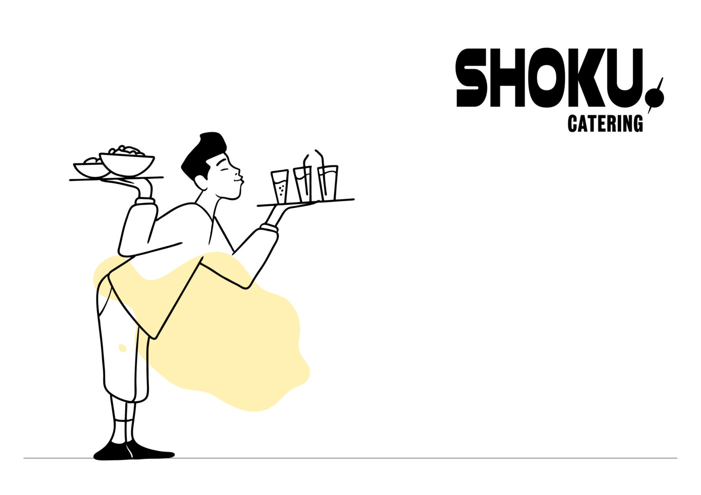

For Shoku Catering, we inverted the traditional hierarchy: rather than relying on a dominant logo, we developed an expressive illustrative world. The mark steps back, allowing an unpretentious brand hero in motion to become the defining signature across touchpoints.
Systemic Cohesion Across UX/UI and Physical Environments
When a brand lives simultaneously across an e-commerce platform, primary packaging, and physical retail spaces, a living system prevents friction between brand aesthetics and pure utility. A static logo pinned to the corner of an app or clumsily scaled across collateral clutters the viewport and compromises clarity.
Instead of prescriptive templates, we craft a responsive framework that orchestrates each medium:
- Modulating Emotional Intensity: he system calibrates volume to context. It exercises restraint on a skincare bottle, a woven garment label, or a transactional digital interface (where, echoing Claude Shannon and Warren Weaver’s information theory, reducing noise is paramount), while expanding into bold visual narratives across large-scale editorial campaigns, motion design, and collector’s lookbooks.
- Attention to Detail: Fluid interface transitions, haptic responses to user gestures, and crisp blind debossing on uncoated cotton stock are held to the same exacting standard. These tactile and digital nuances build an authentic impression of craft and luxury.
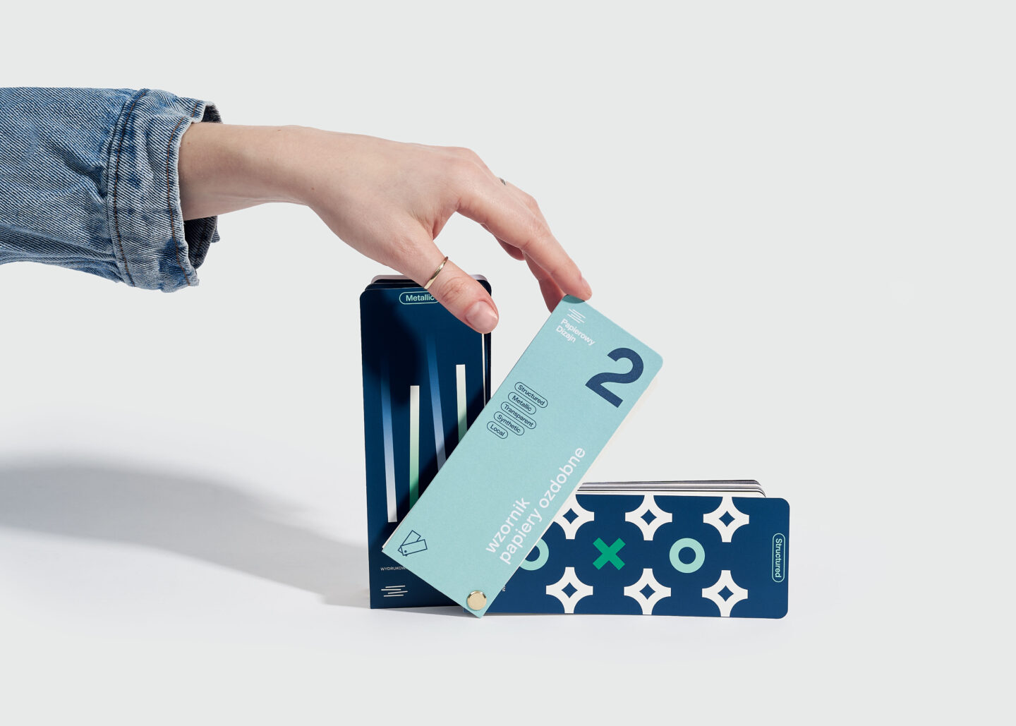
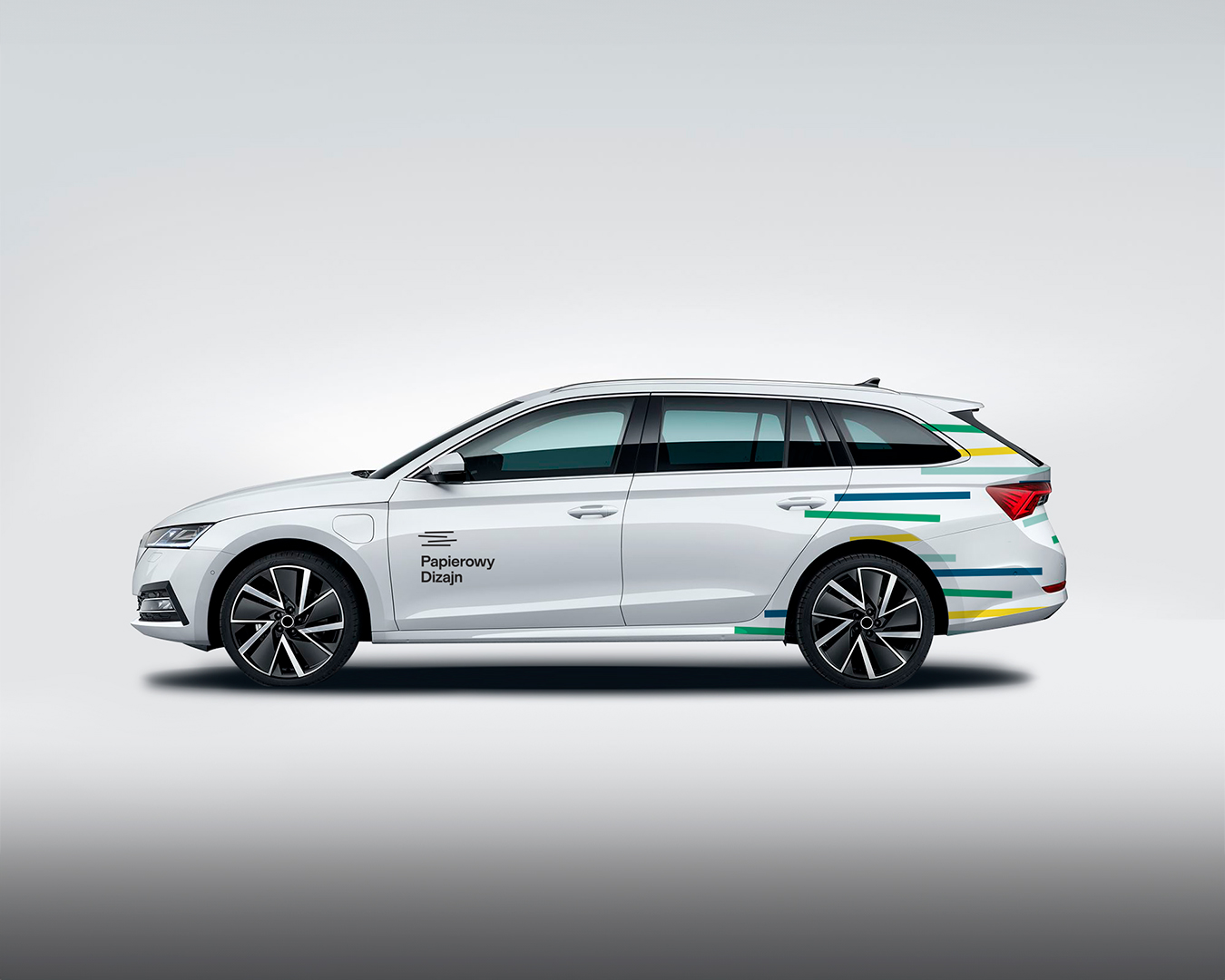
Papierowy Dizajn: A synthetic mark paired with a tactile physical system. The logo is reduced to a minimal horizontal motif inspired by stacked paper sheets, creating space for expressive swatch palettes, varied typographic hierarchy, and utilitarian labeling systems across premium paper grades.
Building Future-Proof Brands
What enables a visual identity to withstand the test of time? Not dogmatic rigidity, but a balance between an uncompromising core and the elasticity to adapt.
At Warsaw Creatives, our philosophy is anchored in modernist heritage. Moving beyond logocentrism does not diminish the value of the mark. On the contrary: we believe that crafting an exceptional, synthetic symbol rooted in modernist discipline remains the most enduring foundation for any brand journey. It provides a timeless anchor. Even as typography, color palettes, and motion languages shift across emerging technologies, an exacting mark ensures the brand retains its essential soul.
Rather than erecting static monuments, we design open systems of clear rules: marrying a timeless mark with an adaptable ecosystem that grows with the business and thrives effortlessly in any medium.

Fluid color exploration for Smart Aging Clinic. An organic, shifting gradient form scales seamlessly across digital interfaces and tactile print collateral, establishing an unmistakable brand presence without the confinement of rigid templates.
Reframing the Perspective
Is asking what a new logo should look like irrelevant today? Not at all, but it can no longer be the primary, isolated question. The role of the designer is to broaden that lens: shifting the discourse from a lone glyph to the brand’s entire visual language. Rather than locking identity into a frozen frame, we must ask how the system will live, sustain coherence amidst sensory noise, and engage the audience at every point of contact.
At Warsaw Creatives, we draw on the finest principles of modernism (synthetic reduction, structural clarity, and craft), translating them into living, scalable systems for emerging visionaries and established enterprises alike. If your brand feels constrained by the boundaries of a static manual, let’s explore how to evolve it into a resilient, future-ready ecosystem.
References & Selected Bibliography:
- Gardner, Bill, LogoLounge Trend Report 2009, logolounge.com / Rockport
- Gimmi, Karin; Formanek, Verena (red.), Corporate Diversity: Swiss Graphic Design and Advertising by Geigy 1940–1970, Lars Müller Publishers / Museum für Gestaltung Zürich, Baden 2009.
- Lorenz, Martin, Flexible Visual Systems, Slanted Publishers, Karlsruhe 2021.
- Frutiger, Adrian, Signs and Symbols: Their Design and Meaning [Polish ed.: Człowiek i jego znaki]. Warsaw: Wydawnictwo Do / Wydawnictwo Optima, 2003.
- Mollerup, Per, Marks of Excellence: The History and Taxonomy of Trademarks, Phaidon Press, Nowy Jork 1998.
- Gerstner, Karl, Designing Programmes, Lars Müller Publishers, Zurych 2019 (wydanie pierwsze: Arthur Niggli, Niederteufen 1964).
- Schmitt, Bernd; Simonson, Alex, Marketing Aesthetics: The Strategic Management of Brands, Identity, and Image [Polish ed.: Estetyka w marketingu]. Kraków: Wydawnictwo PSB, 1999.
- Van Nes, Irene, Dynamic Identities: How to Create a Living Brand, BIS Publishers, Amsterdam 2012.
- Müller-Brockmann, Josef, Grid Systems in Graphic Design / Rastersysteme für die visuelle Gestaltung, Niggli, Niederteufen 1981.
- Brändle, Christian; Gimmi, Karin; Junod, Bettina; Reble, Christina; Richter, Bettina (red.), 100 Years of Swiss Graphic Design, Lars Müller Publishers / Museum für Gestaltung Zürich, 2014.